Final project – Semester 2

I started off with a mind map because, intend to be a person that has too many ideas and too many things i am interested in or feel passionate about. boiling it down to one important concept that makes for a compelling piece, is my mission!

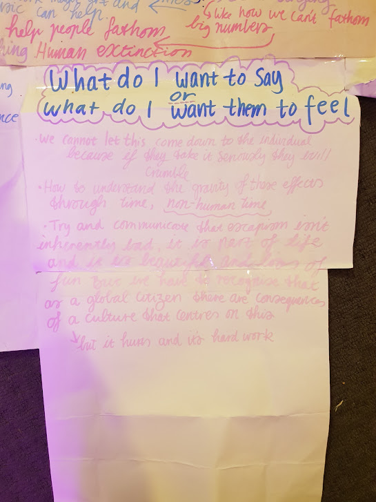
A lot of it is gobbledygook, but it is basically me trying to sort my brain out. I landed on the idea that I care very much about climate change, overwhelmingly so. I also think a lot of climate change art can look very similar. But also I am aware my own pessimism/trauma associated with studying ecology, leaves me with a very specific outlook. That might not be helpful or interesting.

I also wanted to focus on a specific facet of climate change, as most people are quite well-informed with overall information about climate change. I also wanted something that I had experienced, so I wasn’t reaching too far away.

I landed on specific phenomena my friends and I experienced. Before the pandemic, it felt like there was so much discussion about climate change, in ordinary conversations and with politicians. During the pandemic, climate change policy and talk of climate change completely fell by the wayside. This is understandable, we can only comprehend one world-ending situation at a time. After the pandemic, I felt that there was next to no discussion about climate change, and school strikes for climate have completely stopped in Australia. That makes me feel quite distressed, as prioritised action is necessary.

I then wanted to create a filmed piece, as I enjoy all the techniques involved with that.

  • visual texture
  • fun colours
  • interesting/dynamic lighting
  • editing (I didn’t end up doing that for this piece)
  • less of a focus on music, I feel to get a good enough song (because I am so new at it) it takes quite a while. often more time than I have in a semester.

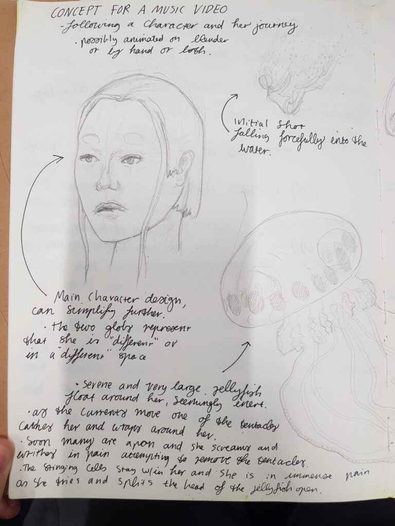
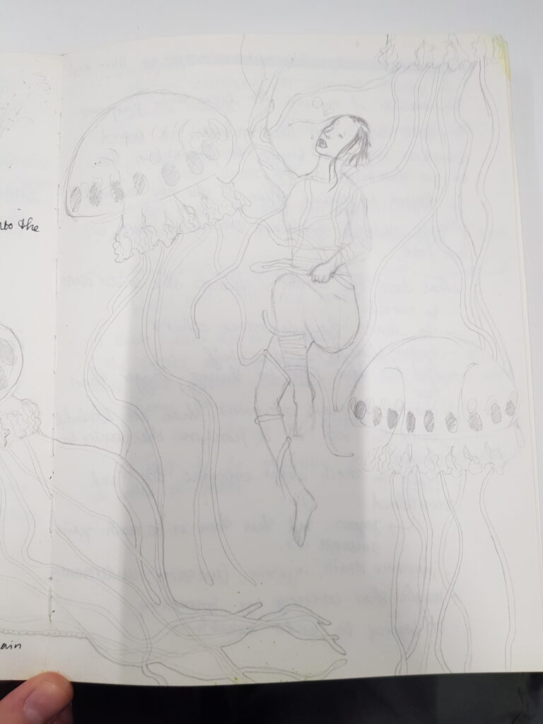
So I started doing some drawings and more mind-mapping/self-questioning. I also wanted to think about a triptych again, I really like the idea of feeling encompassed by the work. Which is something I also tried last semester.

For this piece, I wanted to attempt to subvert the cutesy nature of my previous work. I did some introspection and think I can’t cut out being cute; it’s just natural. So I intend to transform it to help further my vision. I wanted to insinuate that this topic is insidious. There is an underlying wrongness to the situation. so I was trying to find ways of making it sinister. (also yes I did spill ink all over the paper, and no it is not a Rorschach test. But it is interesting that you thought that…).

Some more storyboards.

I decided on a colour theme very early, so that I could implement it fully. I went for primary colours. The blue of the wizard’s outfit, the yellow of the raincoat, and the red of the workers’ outfit.

I also wanted to try different sizes of textures. Like the coloured blocks of photos in the yellow channel. And then contrasting black and white in the red channel, as well as the natural textures of the forest in the blue channel.

I wanted to keep this piece to be visually interesting. I also really liked the captivating quality of ‘Lady Gaga X Robert Wilson: Mademoiselle Caroline Rivière’

I imagine it feels quite gentle in a gallery space. That is something I am interested in exploring.

Wizard channel (representing escape/regression into media and books)

I had already made the wizard hat and had the beard from the first semester. So, I wanted to make a cloak because the back of the wizard would be prominent in the shot. Another reason for making the outfit is I really like making absolutely everything in the shot. Similar to what I did with the last triptych. I find myself an incredibly hands-on person.

This was the start of the pattern I made, I didn’t want to just make a cloak because some of the front of the outfit would be in the shot. I also made the front piece because the weight of the cape could pull on my neck. In historical cloaks, they often had a tie that crossed over the front and tied at the back. So that the cloak wouldn’t keep riding up on the wearer’s neck. I instead made a yoke underneath the cloak at the back that connected to the front piece. Which joined in the middle with some gold trim.

I then drew out many stars onto gold glitter foam. I cut them out and stuck them onto the back of the cape with hot glue.

I had planned to have all three shots filmed before our group tutorial. The only day I had free to shoot the wizard was one, which I had planned to do at a local sequoia plantation. It was storming. So I filmed a week later, after the tutorial.

I included the wizard reading a book because I wanted it to appear like a fantasy. But specifically one where the wizard was going into. The wizard was escaping into fiction. i.e. the person started as normal and then felt more like a wizard after spending all their time engrossed in fiction. I chose this cartoon/storybook version of a wizard because it is inoffensive, it doesn’t single out any type of media/ it also emphasises the silliness of it all, or maybe the levity that is being looked for.

This was one of the first camera tests for this shot. I got my dad to help me focus because clambering through the forest between every shot to check focus was not an option, or at least a feasible option.

I wanted slightly wider framing, even though this is the size of the people in the two other corresponding shots. But because this shot has less movement, I don’t mind that it is slightly different to the other shots.

I also intentionally had my back to the light, even though I knew this would’ve been an incredibly beautiful shot. I didn’t want it to be thought of as a positive situation. i.e. looking into the light. This is another cue to a sad/insidious situation. where the character is turning away from the light.

Shot 2 – red shot.

The concept for this channel is inspired by the journal I read as inspiration. The journal I read highlighted a few specific types of escapism, some of them rather scary. But one in particular that I had never heard about or thought of indirectly that light was ‘right-wing escapism’. It talked about people who had a hard life(lots of people do) and feel the need to create a fantasy where they feel empowered or important. This is not that crazy; I personally imagine how my life would be different if I sporadically grew wings or found 1 billion dollars. The difference is that the ‘right-wing’ tries to enact its ideals on other people. This is highly problematic and contentious, as we are all aware. An important part is that there is a very vocal community. This makes these people feel as if everyone agrees with them. Making their ideas more righteous.

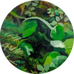
I chose to use this type of art style in this piece (these are all drawings I did a couple of years ago; I took an art subject as my breadth). I make these drawings by initially looking at a picture and painting what I can see very quickly with black calligraphy ink. I would then use a light box, and paint on a new piece of paper, either the outlines of the original piece or the white parts. I would then get this cool abstraction that kind of looked like the original, but all the more varying texture. I would use many different techniques to create variation

  • folding over the page and then outlining the folded over drawing
  • Multiple designs onto one piece of paper, so the flow of the lines would change.
  • using different types of paintbrushes and pens that would create different marks

I made more of these for this piece(actually, every one in the final shot I painted for this piece.

the original intent of the work was ‘echos’ of each other. I combined photos from two locations and altered them with my drawing till they were indistinguishable. It was about looking for connection. The piece was called ‘Echo’.

It was perfect for this work because now it creates an echo chamber. Where it represents discussions that are transformed between online media and conversations till they barely look like the original image/message. This is referring to misinformation and the weird inside jokes/online culture, where people fall further and further away from reality. I chose to keep with the natural theme of the original work, as I wanted to create an abstraction away from nature.

I wanted to give the red character something to do, but I also wanted to highlight the conspiracy-like, out-of-touch nature of these people I was trying to emulate. So the character threaded string around push pins throughout the art. I was also trying to do it subtly without writing or saying things like ‘they are putting chlorine in water to make the frogs gay’. As that is not something I want to address explicitly in my work. I hope that the red cap is a visual cue to American MAGA hats.

I wrapped the red thread around the push pins 5-10 times. As we saw in Sophia’s piece, small red thread can be quite hard to see on camera. So I tried to make it as thick as possible so it could be seen fully on camera.

This is a still of frame, once all the extra thread had been put up.

The Yellow raincoat person.

This character symbolises denial. They are covering up the outside window with more idyllic pictures of nature. The large fabric North American animals are larger; this is so it can be seen in the frame. As some of the smaller printouts aren’t, particularly visible. The reason the character is wearing a rain jacket, this represents a further layer of separation from the outdoors.

I trialled a few windows in my house, but ultimately I chose this window because I could move the camera far back enough to create a wide shot

I used a broken curtain rod to make the middle fabric panel float in front of the other. I wanted to bring some more dimensionality into it.

I pre-taped all of the images so it was seamless in the video and I could cover everything within my 6-minute time limit.

This is me gathering the hem and placing it around the neckline so it would sit right. I also wrapped it closer to the front of the garment so that the cape would sit nicely around the shoulders.

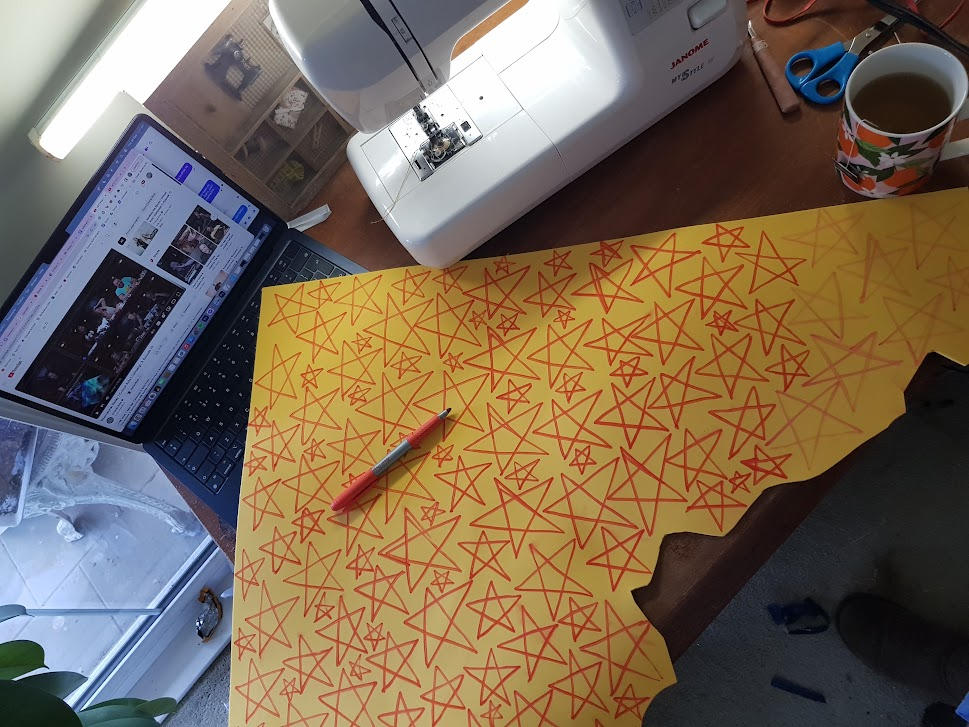
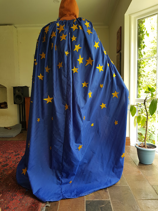
I made a gradient with the stars so they look like they are falling from the sky.

I also like this art aesthetic

This is the final shot. I filmed this at 7 am, as I knew the more horizontal light would cast really beautiful and dramatic shadows.

I am glad that the light lit up all the mossy rocks and branches. It feels very magical.

In this shot, there was a really beautiful dawn chorus of birds and no cars driving around, as we were deep enough not to hear them. The sound was picked up really well on the camera mic, so I was able to use that in the final audio.

I made the drawings/paintings above in 2021.

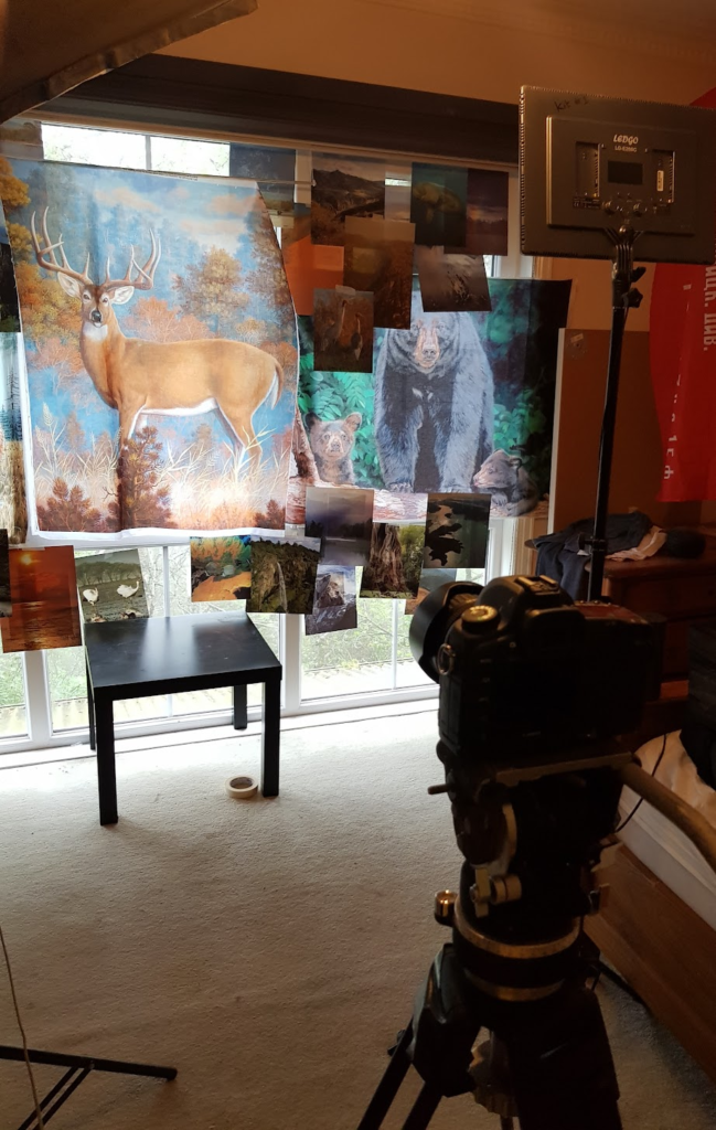
I used a white bed sheet to block out the window so I could create a room with 3 walls.

I chose to use the studio at the front because it has this little hallway area, where I could better position my camera. so that all of the paintings were in frame.

These ledgo lights were perfect for a bright, indirect light. They helped with making the walls seem really flat.

I cut out photos from these four beautiful nature photography books, carefully picking photos with no human intervention. They were very nostalgic photos and felt very old school. I think they were mostly shot on film. Or at least early digital, where it all looks a bit flat and overly texturised.

I had a very interesting dilemma because the shot is so backlit by the window. I had to use four lights to try and match the outside light so the photos don’t appear completely in shadow. also interestingly, as I covered up more of the window, the darker the shot got, and it eventually became under-exposed. It was only slightly, and it was in line with the message, so I didn’t mind. I had to bring in a second fluro light to light up my body as I had to use so many lights on the wall/window.

Tape was integral to this piece, as hot glue was to the wizard outfit.

This is the first frame

And this is the final frame.

Group tutorial

This is the video I showed for the group tutorial; the wizard was just a placeholder as filming was delayed.

I felt the Group tutorial was quite helpful, as it showed my artistic intent wasn’t obvious. Which was something I was worried might be the case. I didn’t want to spell everything out for the audience so that they could have a good think and come up with their own ideas. Maybe I should’ve spelt something out for them.

I decided to include some explicit imagery that signalled climate change and not just nature. as that seemed to be part of the confusion. so I found some extremely terrifying footage of Australian fires from 2020 on news channels.

I found clips that were longer than 4 seconds and showed complete and utter destruction. I wanted it visually to look nothing like the other footage so the audience could extrapolate the footage and possibly apply it to the other footage. or notice that the three characters are ignoring it (not blissfully).

I used the camera sound of the birds and the wind in the calm portions of the video and re-used the ‘1-hour ambient forest fire – DnD’ for the fire clips. Hoping that, sonically it would wake up and energise the audience.

I interspersed five clips about 1 minute apart. as the audience becomes calm and understands the pace of the piece, with the three characters moving gently. They are shocked and surprised by what was just unleashed onto the screen. It then snaps back to the calm footage; it no longer feels peaceful. It feels sinister. The once seemingly harmless movements become malicious. The audience questions why the characters ignore this calamity, ‘what on earth could possibly be more important than this??!?!’.

Or at least that is the reaction I hope I can create. Even if the audience doesn’t understand or know of the theme of escapism, they can understand that something is amiss. And hopefully, the turnedbacks will solidify this message.

Set up and final adjustments

I used three projectors and 3 bright signs and set them up in the mezzanine.

I initially set up with the wizard to the left, as I had shown it in the tutorial. as I wanted it to show an increasing distance from nature. Wizard, in nature. Raincoat separated from nature. Red, complete abstraction/disconnect from nature.

However once I set up the projection, the action looked lop-sided as the wizard only gently turned the page of the book every now and again. so I moved the wizard to the middle. It was symmetrical and very satisfying.

these are the three separate final videos:

What was successful?

  • The red person channel felt beautiful to me. Having nothing to frame it and having the white blend into the walls made it seem like it was almost painted onto the walls. It could be an interesting effect for a different project. Working maybe with coloured walls, or at least try this black-on-white effect again.
  • Also the effect of even lighting on a space. It became flattened and distorted. Very cool, I would like to try and work with different spaces maybe. And having the individual in different sizes relative to the space and screen.
  • I am very proud of the wizard outfit; making a pattern from scratch from a drawing was so fun. I wanted a specific look, and I was able to get exactly what I wanted! So fun.

What could be improved upon?

  • Something I consistently notice with my art is that I am visuals first. I want to create an exciting and dynamic visual piece. I then get overwhelmed with the intellectual part of the piece, either because I feel a great sense of urgency and passion about many things, or it is a muscle I am just not very good at flexing yet. I would say this piece is the epitome of that. I have very few qualms about the visuals, as most of them came out exactly how I wanted (one I will say something about). I feel the piece’s intent is cloudy; it’s a niche topic, and it was addressed like a mainstream topic where the audience was very educated and had a lot of skill to read between the lines.
  • In future, I am not sure how I will fix this, I think I will try to have a longer time to focus on lots of different concepts. I think it would be better for me to make lots of ideas, and then scrap the bad ones. instead of trying to put too much into one idea and being too precious with it.
  • The yellow raincoat channel, I think, was the most conceptually well-done but technically lacking. The reflection of the glossy photos obscured what was in the pictures. I also think it could have looked more dynamic. I think if I could’ve hung the photos at different levels with something like fishing wire. or I could’ve found a window that was much flatter. as mine had very pronounced window sills, which meant a lot of the pictures hung at an odd angle.
  • also, I think the juxtaposition between the high-res still image and the very low-res fire image is quite annoying. I think it would’ve been very powerful if the fire was crystal clear. (but I will not be filming any bushfires like that any time soon) so I just have to make do. or I could’ve tried some video upscaling AI, but I haven’t seen any that are particularly successful.
  • there is a lot of personal distress with the lack of resolutions within this piece, as you can see through my criticism . I think one of the reasons that I cant be excited or proud of this work, is that I still feel very emotional towards this subject, and am still quite stressed about it. I have not made any personal resolutions on the matter, my lack of reconciliation on this topic reflects the complexity and dire nature of the dilemma I am exploring . there is an ongoing dissonace between my distress at the urgency of the situation, and the ‘fix’ that is my art piece. which i would deem in the scale of things, not enough.
  • although i still think i did a good job, and i tried immensely hard. Working everyday.

Personal exploration

Artistic things that I like

  • The quality of k pop music videos (i.e. Camera angles, tracking Multi-cam slider)
  • Avatar! has amazing visuals epic (large) Story W/ lots of emotion
  • Akira!
  • Beautiful Imagery, the still exciting story doesn’t love its intrigue without being overtly arty.
  • Something in this course I am really worried about is that I will make Shit student films. They will be grimy and have metaphors, will be long and slow and will lead to little.
  • I want to focus on music as a starting point, but I don’t want it to be experimental, long, and pointless; I want it to have depth and emotion and still sound like music. Not just sounds.
  • I want things to be bigger than me.

The concept for a Music video

(all the text from every photo has been transcribed. No need to read it. Just look at the pictures)

  • following a character and her journey 
  •  possibly animated on blender or by hand 
  • The initial Shot falls forcefully into the water
  • Main Character design,
  • Can simplify further for animation. ・the two globy represent that she is “different” or in a different” space.
  • •Serene and gigantic jellyfish float around her, seemingly inert. 
  • As the current moves, one of the tentacles catches her and wraps around her. · Soon, many are apon, and she screams and writhes in pain, attempting to remove the tentacles. The Stinging cells stay w/in her, and she is in immense pain as she tries to split the jellyfish’s head open.
  • WHAT DOES SHE LOOK LIKE/ WHY
  • I want her to be human. The circles on her head are important. She isn’t some ignorant character. She has control and can change things, So she can change her form
  • It has to be realistic so I could be able to make it
  • Representation of myself for long-term purposes
  • A person who has been put in a weird situation and is trying to figure out how
  • to get themselves out of it – trying to decide what is the new normal
  • • Maybe Multiple ‘gods’ are ‘trying to mess wi her fate.
  • What does she want? / things she could want to survive
  • to learn how to protect others + Identify her true self
  • – find her true self in things bigger than her
  • -yearns 
  •  -finds to make decisions that are worthwhile herself. In a position she wants to Control. Feels so much about everyone else and becomes overwhelmed
  •  Joyous
  • Sad that there is so much anguish amongst us.
  •  pain 
  • Innocence
  •  Death
  •  Injustice
  • Curiosity,
  • maybe she is covering up something
  • or trying to undo something

Project 1 – Setting the scene

Our task was to get used to using a camera and seeing what we can make from our environment. Tasked with finding things that interest us and trying to find a theme and keep to it.

I decided to only look at people’s feet, more specifically, their shoes and how they walk. I took videos from low angles trying to capture people moving across the shot.

I filmed people in our class and then people in the wild.

After collating the videos, I realised there was a really interesting difference in the sound of people’s feet. Sadly, the quality was not good because I only used the camera mic and not a directional mic or anything like that. I spent time trying to single out the foot sounds, but it wasn’t very successful.

So I attempted to make music out of it.

What I think was successful.

  • Camera framing was good.
  • The variety of sounds was interesting

What could be improved upon.

  • Sound quality, if I initially recorded them with a good mic. I think I would be more excited actually to make something of it. But because it was so bad, I didn’t feel it was worth my time
  • The timing is a bit weird; I’m not sure what the rhythm is. I think if I actually,y wanted to make it musical, I would upload each individual noise into a music production software and organise them there. Then go back into Premier Pro to match the visuals.

Kenneth introduced us to the concept of granular synthesis

Granular synthesis is a sound processing technique that involves chopping up a piece of audio into teeny-tiny particle fragments called “grains.” By micro-sampling these grains, which are typically 5 to 200 milliseconds (ms) long, you can synthesize new sounds and patterns.

output.com

This was made into video art by “GRANULAR SYNTHESIS ”

The piece Motion Control MODELL 5 by the group “GRANULAR SYNTHESIS ” is a direct descendant of video art with a penchant towards techno dance and rave parties.

I really liked this; it was scary unexpected and very interesting. one of my personal favourite parts about music and a guiding force behind my own work is the concept of ‘ugly sounds, beautiful music’. Granular synthesis is a perfect example of this. Although you might say, this example is only ugly. I think it is a great first step to create work after it.

I made my own version of it. A much simpler version. I will also say that this is one of the first things I edited on premiere pro, and I was still figuring my way around it. I used this exercise to help orientate myself.

What I think was successful.

  • the imagery was interesting, the comparison between different types of hsoes and their sounds was made obvious by this format.
  • i liked that it took the viewer out of everyday life and threw them in this weird world of glitching. like the clip moves on without anything changing. had a weird feeling to it.

What could be improved upon.

  • The final clip of the video was too long, it takes up almost half of the video time.
  • i think it would have been interesting to extrapolate it, creating different sounds from different shoes. then layered next to eachother to create a cacophany.

Project 2

We were expanding our editing capabilities with this task and were focusing on the green screen/chroma key.

But first, we did some projectionist work. Our group brought bottles from home, and we used some tulle and started projecting onto it.

Experimentation included

  • We were playing with the light refraction from the glass bottles, which would change when we spun them.
  • Projecting onto the tulle gave us multiple layers of the projected image.
  • We also moved the tule around to see what it would do.
  • We changed the imagery being projected; aquariums, candles, sunsets, hypnotic imagery, and rave colours.
  • putting people and hands between and behind the tulle to create shadows and light people up
  • Switching in and out different coloured gels.

After this, we learnt how to chroma key. I decided I wanted to do that for my piece but still use some of the footage I made here.

What I did/how I did it

  • Cut up all the interesting bits of the footage. Into small segments of about 2-4 seconds.
  • Then put them in a cohesive order.
  • I also realised that with the video with rave lights, I could chroma key to the individual flashing colours. So the video would turn to see-through at random intervals.
  • I then put an interesting video behind that. With lots of fish from the aquarium. Because that’s a personal love of mine and will be made apparent later in this project.
  • This ended up making a visual texture. But I wanted it to be a tad more chaotic
  • So I overlayed the video from above and chroma-keyed all the red bits. To create even more layering.
  • The texture was great, but I wanted to add more exciting components. I grabbed lots of ‘green screen fish’ from youtube and put them in over the top.
  • I also got some footage from the Monterey Bay aquarium kelp cam and removed the background using Chromakey again.
  • lots of things going on !

We also took some videos in the studio with a blue background, intending to make them into floating people. So I did some dancing. I actually had quite a bit of trouble correctly chroma-keying this because the lighting wasn’t flat when we filmed the shots. In the final clip, you will see some dark blotches around the back of my head.

I also so added some music, ‘Boom Boom Pow’ by the Black Eyed Peas. Because that song is lots of fun.

I also timed the dancing people to come in on the beat, to keep the flow of the music and sync the vibes.

What `I feel was successful.

  • People thought it was funny.
  • It got across my love for fish and The Black Eyed Peas.

What could be improved upon.

  • As this was a purely experimental exercise, I don’t think I would change anything. It was my first time doing anything like this.
    • I would try to make the green screen’s lighting slightly flat.
    • I actually worked later with Hen and Ash, and we figured out how to get a really flat background. It did take like 30 minutes.

Project 1 – Place

When preparing for the projects about ‘place’ at Fitzroy Gardens, I could only bring an underwater camera. My sister was using the proper camera for the day.

I hoped there would be ponds, and there were! I wanted to look at this public space and find the bits that were a bit more private, a bit more secluded. That was unreachable for the everyday person (unless you read your book in a pond). I was looking for a perspective that wasn’t often seen.

I was also specifically looking for wildlife (fish, bugs, tadpoles), and I saw none, which made me very sad. But I persevered and looked for places with interesting shadows and diverse textures.

After properly seeing the footage after I got to a computer, I realised most of it was out of focus, which happens when your arms are under the water trying to film something you can’t see.

I still liked the quality of the videos; it kept an otherwordly feeling and showed cool micro things.

I didn’t have time to edit the videos properly before the group tutorial. It ended up being just a chronological order of my favourite bits I had filmed. Not what I wanted to present, but it I was all was able to do at that time. But I got some good observations.

-the shakey camera made it seem naturalistic and raw

-the soft focus shots highlighted changes in tone throughout the clip

These are interesting observations, but I can’t help but think my peers were just being kind. However, I do agree with them… sort of

Entire footage captured on that day and what I presented to the group tutorial

Because I couldn’t record any sound underwater, I wanted to create a soundtrack to create a more cohesive and emotional theme between the clips. I wanted something a bit plunkier; I usually do dramatic drones that change over long periods.

So I went with an organic-sounding instrument in the first half, almost to ease the listener in. then changed it up in the second half by adding a synthesizer to make it feel more alien and otherworldly.

I then cut up my favourite clips from the day and separated them by above water and below water. I matched the shots with the music, changing shot lengths to create variety and keep pace. Especially in the second half, where the intent was that the viewer felt like they were thrown into this otherworld. A place that is difficult to see and can only be viewed A place shrouded in obscurity, visible only to those brave enough to delve into the depths and murk of a pond

I was delighted with the outcome, and the music was better than I expected of myself.

What I think was successful.

  • The music was catchy and had a melody that made sense with the footage.
  • The music had diverse sounds that still worked (mostly) with each other. Which is something I have struggled with in my music practice.
  • The change-up of the timing of the length of shots meant that the repetition of similar shots wasn’t too boring, and it kept a pace that matched the music in a different way

What could be improved upon.

  • The shakiness of the shots meant that they were often moving in sporadic directions that were hard to control with the quick cuts.
  • The out-of-focus meant that a lot of exciting shapes were lost
  • The colours of the shots in the second half were very same-samey. If I could have shot in different ponds with different plant types, it would have helped. Also, probably because it was a very overcast day, and not much light was being let into the pond.
  • I just repeated the melody twice, which I am mostly okay with because it’s okay to repeat when you’re onto something good. I could’ve added chords underneath it to make some more musical movement and emotional swelling, but that is a lacking area in my music education. So I will have to do some youtubing.

Project 3 – The interview

For this project, I wanted to go in a more unconventional manner. I also was thinking about people in my life that would be okay with me interviewing them. I realised that most of my family or friends would be quite self-conscious, especially since I wanted to take lots of videos of their faces.

So I opted to do a video of my dog, who, luckily is not self-conscious at all. Im not sure if she is even conscious of self, to be honest.

I was really inspired by the aesthetic style of Wes Anderson. The warm colour tones, cohesive colour pallets, and symmetrical framing are really captivating and I feel incredibly calming. I also wanted to implement the colour grading we learnt in class.

So I filmed shots outside to take advantage of the autumn leaves and created a small and succinct story about my dog. I also took some videos inside which I found really hard to replicate the Anderson style. It includes bright colours, vintage patterns and symmetry. Which I didn’t really have in my home. I intended to do more shots inside but just didn’t have the facilities to create the exact aesthetic I wanted. So I cut the video shorter.

  • What was successful
  • it was incredibly cute!
  • most shots were symmetric
  • Pearl ended up being a surprisingly good actor
  • what could be improved upon
  • The colour grading was intense in some of the shots
  • I wish I could have got more couch and comfy shots at the end. I would have needed to either use other people’s houses or buy some props. Which I wasn’t able to do at that time.

Project 2

Materiality

I was given ‘Cats and Dogs’ and ‘Through the Past, Darkly’ by the Rolling Stones

My original intent with this video was to take apart and reorder it using only clips with Yellow and/or Blue. Destroying the linearity and breaking the footage up like a paint palette. I intended to make a seamless transition from blue to yellow. After putting them all together, the theme didn’t come through, obviously enough. After talking with Sofi, she suggested I look at thematic elements and mentioned that polar bears are quite a powerful symbol. So I attempted to use that to talk about animal cruelty in everyday life. And how it is not as distant as a zoo in China (where the second polar bear clip is from). This video is as close to that concept as I could manage. And I wouldn’t say I liked it at all; it was incredibly boring, disjointed, and with no clear theme. I needed to rethink it. I needed a…

BRainSTorM

  • I could make the animals look like video game characters and give them different statistics and abilities.
  • I could make animations of the pets running.
  • I could print these frames on paper, cut them out and take a photo with a different, real-world background. (I didn’t do this because cutting all those frames out of paper would take too long).

Plan of action

I decided that cutting the images out was an interesting take on materiality, transforming the material back into something tangible and then back to film. I then decided that literally cutting them out of paper and taking photos would take a bit too much time but cutting them out virtually was a possibility.

The theme of removing the characters from the original footage and transforming them digitally still held the concept of altering the essence of the material and the director’s original intent. Which I thought was cool.

I took screenshots of each frame and then sent them to my iPad, where I cut out each frame using Procreate. I then layered different backgrounds behind them.

I chose for the cat to go through the Australian bush into Minecraft, into the nether (an area in Minecraft that you can only access by going through a portal) and out again.

I added the cut-out cat back into the original film and added the rolling stones music back into it to further the strangeness.

What `I feel was successful.

  • The cat coming out and transforming was really unexpected, and I feel throws the linearity of the piece away.
  • I think how I cut out the cat with chunky legs looked good.

What I could work on

  • The timing of the music was really jolting, and I think it ruined the piece, to be honest. After I presented the piece, I figured out how to loop the cat, which was the reason for the original weird timing.
  • The length of the shots for the backgrounds was probably too quick; I could also fix this by looping the cat to make the shot longer.
  • I also would have re-recorded the VHS because I think all the fast-forwarding was distracting and didn’t necessarily help with the concept. unless I moved the cat through the fast-forwarding, that would be cool.

Project 3 – Colour

I was very lucky to be given dark blue as my colour! It is one of my favourite colours, a colour I intend to use in my art, and it is historically potent! Something you need to know about me is I love whales.

Giant Underwater Whale GIF | GIFDB.com

I recently watched a documentary about how intelligent specifically sperm whales are and that they have a very complex language system. The young whales would babble for the first three years of their life and then, with their mother’s guidance, start singing the same songs as their family. I thought this was awesome. And apparently, researchers are trying to create an ai (similar to chat.gpt) that will help with decoding what they are saying. by collecting thousands of hours of sounds and collating them into a format and then looking at usage rates of words between all languages. For example, every language has its version of the word mum, which is used about the same amount across all human cultures. So they intend to extrapolate these statistics to try and get close to understanding sperm whales as we can.

I love the idea of using ai, this new and technological instrument, to discover the secrets of whales and language deciphering itself. We are using this intelligence we created to try and understand the intelligence of a different species.

This is why I chose to make my video using ai.

How I did it

  • Step 1: Download file locator and converter from FaceHugger (this took about 6 hours)
  • Step 2: Download free code from Stable Diffusion (a visual ai system)
  • Step 3: Upload both into collab, a google chrome code interface
  • Step 4: Fill out all system settings. Including frame rate, ratio, camera movement
  • Step 5: Trial a prompt. I did (sperm whale, in the distance, underwater, swimming towards camera, ocean
  • Step 6: Wait 8 seconds for each frame to render.

First ““`frame

Last frame

  • This was not how I wanted it to look. I got the aspect ratio wrong, and the imagery was weird and was all above water which is not what I wanted.
  • I found out that when you put the word prompt in at the start, it slowly devolves, and because the previous frame infers the next frame it still looks cohesive. But I think this inherent entropy is weird but also beautiful.
  • Step 7: rewrite the word prompt. I removed ‘ocean’ and the ‘sperm’ from sperm whale because I wanted it to be underwater. And I think the sperm bit made the whales look weird and unrecognisable. And then render it.
  • Step 8: The photos looked great. I then uploaded all 500 of them to Imovie and timed them so the frame rate would work. I also matched it to the music.

What I think was successful.

  • The whole piece was cohesive, and I think the music matched well with the pace.
  • I love how, as the film went along, the whale imagery distorted into swaths of colours

What could be improved upon.

  • I could’ve put different word prompts timed to different frames so that the images would change whilst still referencing the initial prompt. For example, the whale looks left, the whale blinks, whale spins around. This would’ve of taken hours of rendering and all the space on my hard drive, but would have looked great. I also would have lost that entropy in the last half. if there are more prompts in a shorter timeframe, there is less time for each frame to devolve