Semester 2 2025 – Final project

This semester I knew what i was doing from the start, I had a vision on the holidays and started working on it as soon as semester started.

I plan to do a robotics piece that is a simmulation of what the sky looks like when it storms.

I had a fiew ideas of how I was going to do it

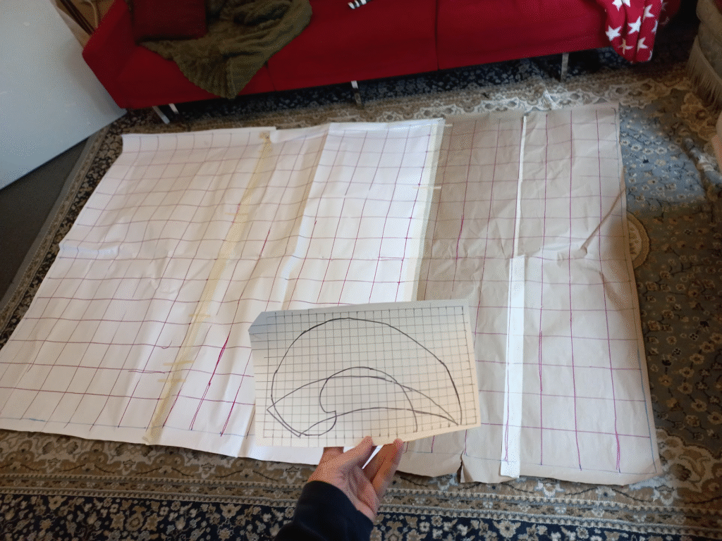
  • cover the ceiling of a room in light coloured fabric with lots of valleys and peaks so it has some uneven cloudlike shapes, then project onto this footage of storms and birds. specifially black cockatoos, as where I grew up seeing a black cockatoo meant a storm was coming
  • Hanging fabric horizontally on the ceiling with lots of “vents” and then situating fans along side it so that it moves. I also wanted to include a smoke machine, but specifically the ice ones, that make the smoke cling to the ground.
  • program robots to lift and raise the fabric and move like a choreagraphed dance to music. set up in a grid formation of 9, so that I can make complex patterns.
  • create an elaborate musical piece that extends the water cycle into a journey about moving through death and hard times (my family friend died this semester, it hit me really hard and I wanted to mark this death in a way that i could understood and move through it. I planned to include lots of singing, synthesizer sounds, some cello and hopefully drums.

Meanings and messages:

These were my options and I chose to program the robots using Arduino, a hardware computing system I have fiddled with previously.

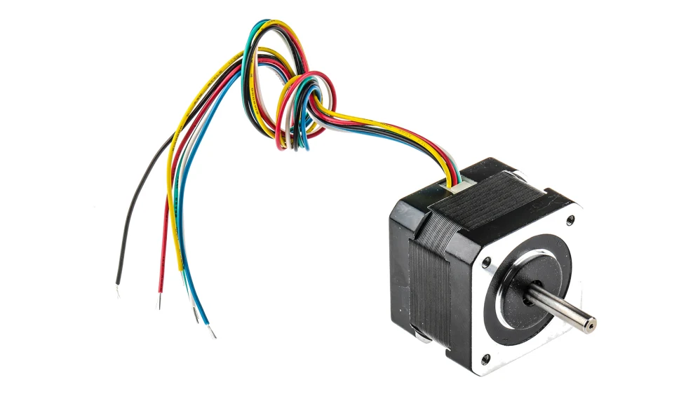
I researched different types of motors and landed on stepper motors, which are very precise and can be controlled down to a half of a degree (as in 360 degrees in a circle, and precision up to 720). It also has very precise speeds, this means I can have the motors chop and change quickly and slowly. these motors are mainly used for 3-d printers.

I then with the assistance of chatgpt, made a shopping list.

  • NEMA 17 Stepper Motors
  • A4988 Motor Driver Boards (one per motor)
  • Arduino Uno or Mega
  • 12V Power Supply (for stepper motors)

I went to Jaycar and got everything I could, this is where everything went wrong.

First off it was $150, which if i wanted to make 9 of them it would cost $1350. Which doesnt include the fabric that I would need which would be expensive.

And secondly, because I am writing this after the fact I can save a lot of turmoil.

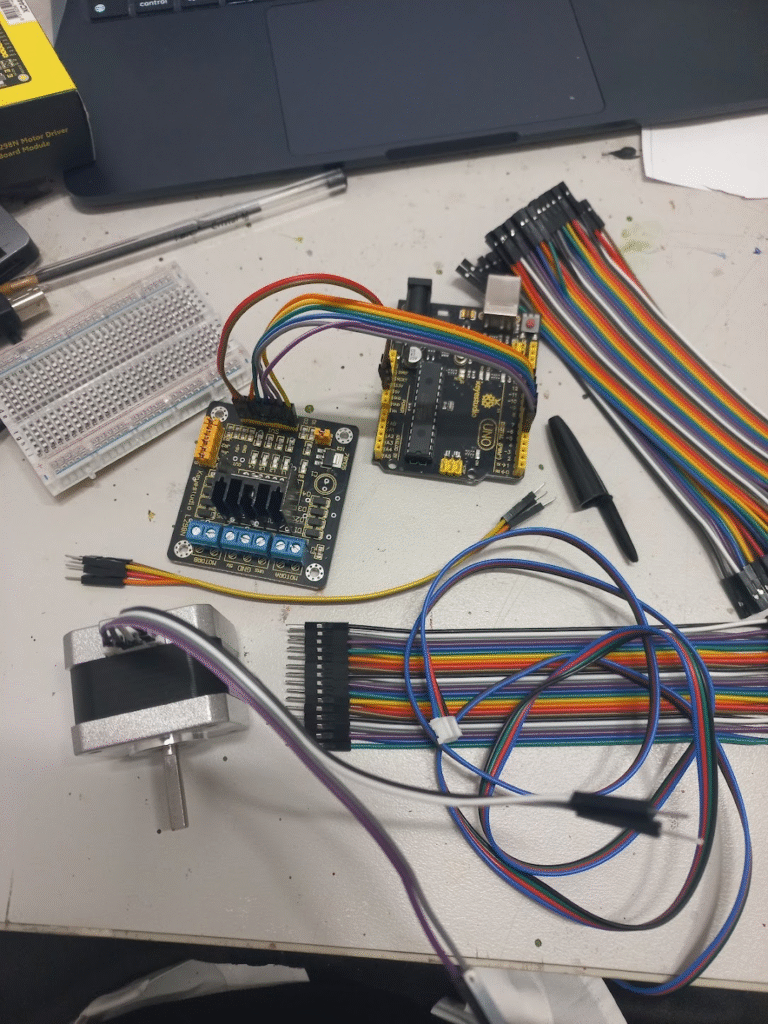
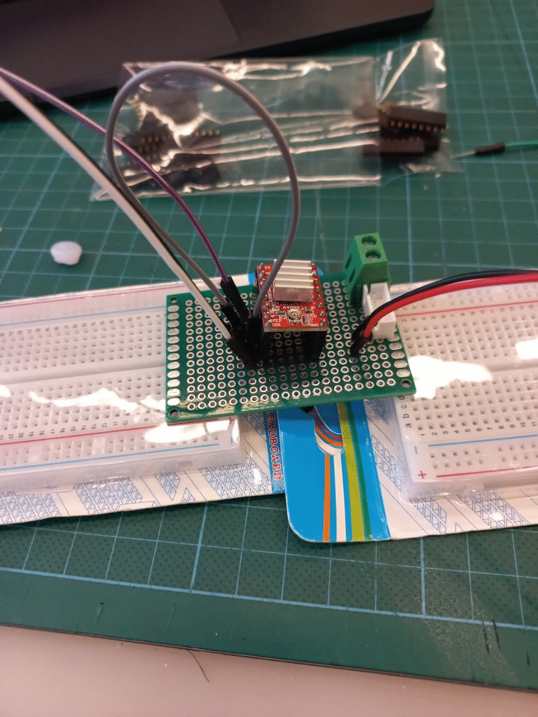
I was looking for the A4988 driver, but Jaycar didnt have it, they suggested the L298N Driver. Which is the one I am connecting in this picture.

I could not for the life of me get the motor working. So I figured I would ask for help, I joined the Mechatronics engineering club and met Jai.

He was helpful in teaching me the basics.

Sadly he was just as clueless as myself. and in some areas pointed me in the wrong direction even though I thought that he was wrong I still listened to him.

I also had another similar reaction with a jaycar employee that told me that I was using the wrong voltage for the stepper motor. He was incorrect, but at this point I figured out how to trust myself and my own research and I ignored him.

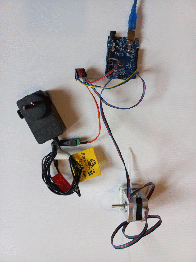
This was 8 weeks of fiddling with nothing working, in the process I shorted my arduino and had to get it replaced. But finally I figured it out, I should have just insisted in the first place that I needed the correct driver, instead of trusting some random.

New Motto; Trust no one, do your own research.

I will now start my own anti-vaxx and engineering movement (joke)

Thus began the actual prototyping, with more than half the semester gone.

I was trying to figure out the physical mechansim to move the string. I initially was going to make a big wheel. Then I chatted to my engineer uncle and he said that the wheel would only be able to pull the string up or down as the same measurement of the circumference, or it will start going back up again. So I moved into a pulley system, the mechanism that turns a curved line into a straight one.

Hooray! It turns on, but my coreflute proto-type is absolutely useless! Lots of issues are going on with things slipping, but I also need a counterweight. when it pulls the string “home” it works, but it has no ability to “push” the string, so it just unravels in the air.

I then, recomended by Isaac found the makers space in the library.

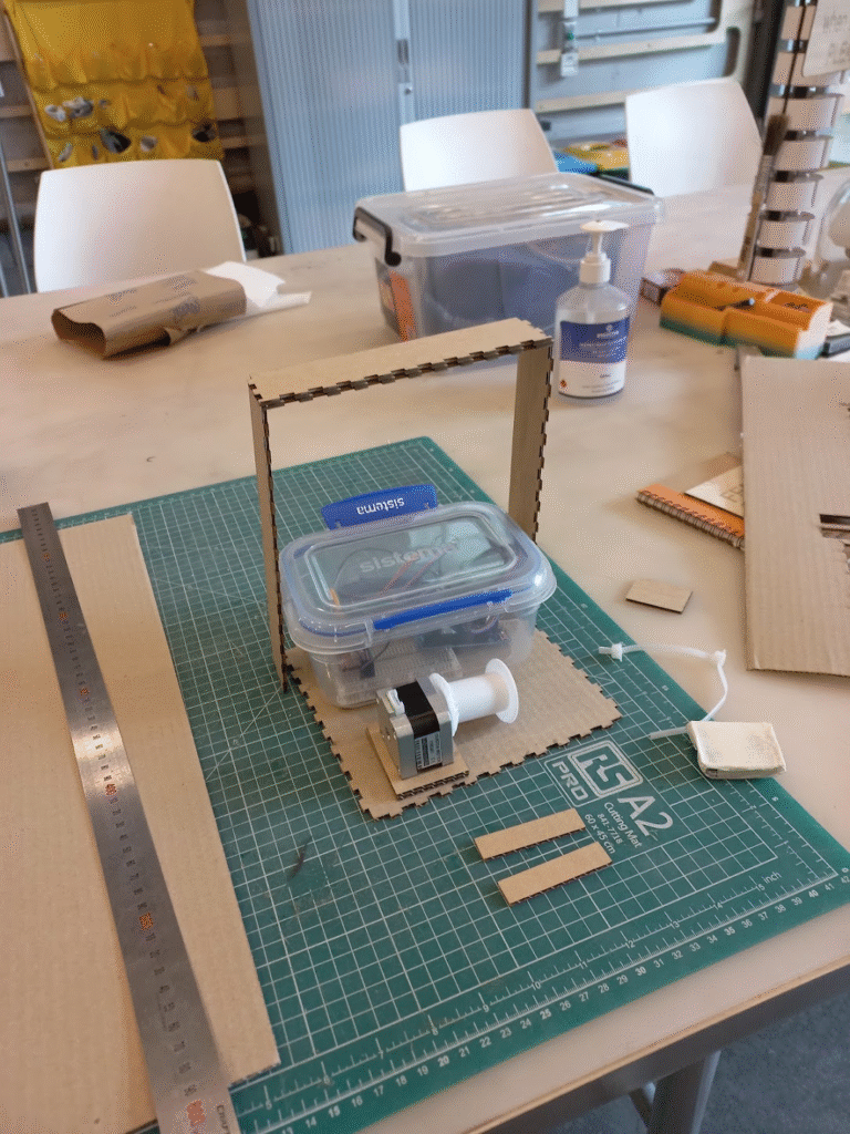
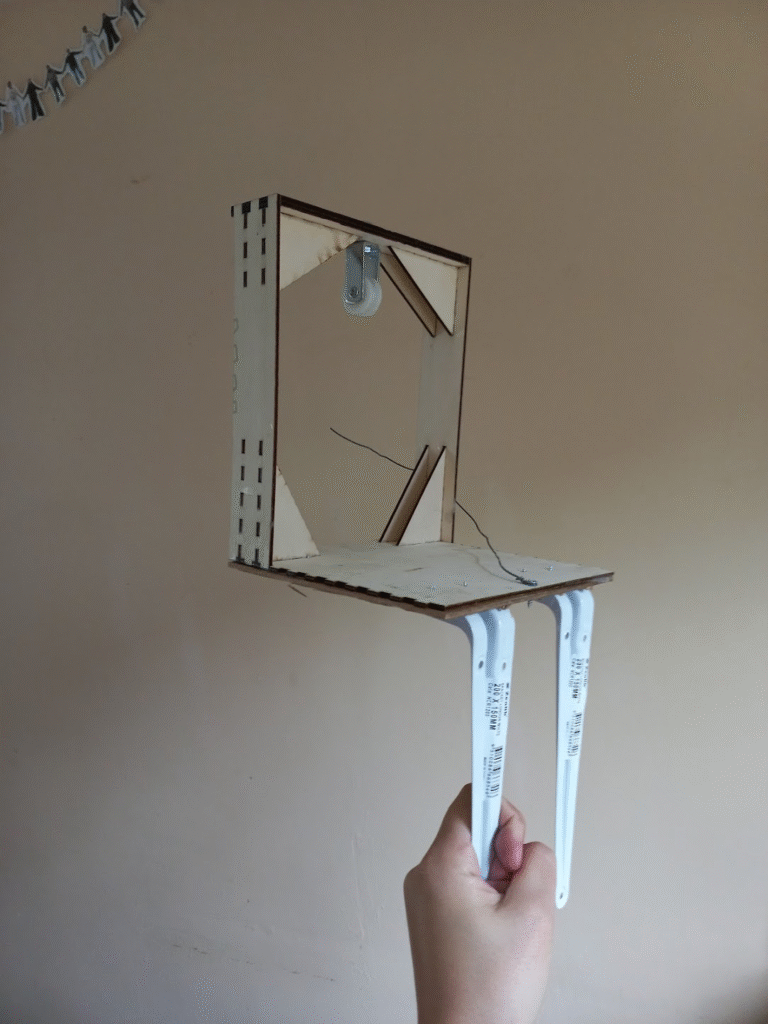
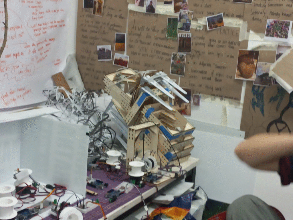
I started by lazer cutting some cardboard to make a practice frame.

It worked well! The square cut outs on the side allow me to glue other wood on to it.

I also made a mount for the motor, with a little divit cut out for its base and two tracks that are glued underneath with an opening where I can run a cable tie. so the wood will all be glued on but the motor will be cable-tied in, incase I need to change it later on.

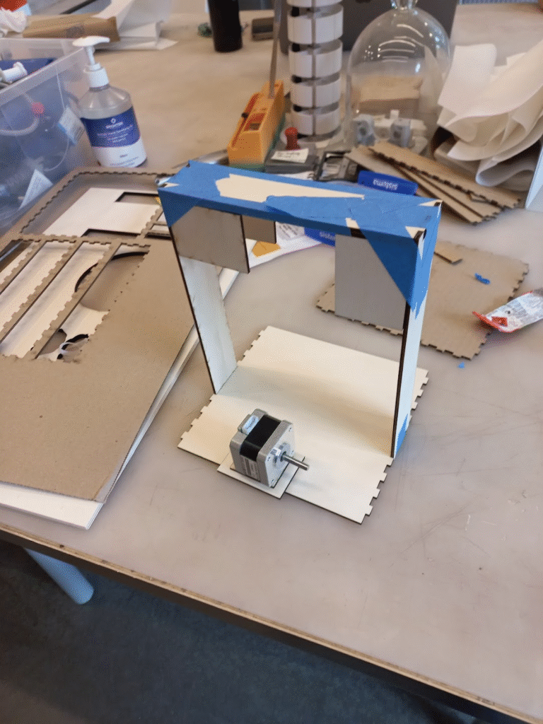
This worked excellently!

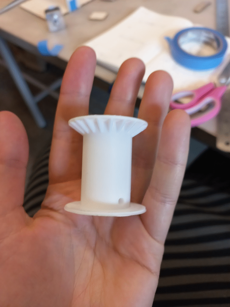
I then found a 3D spool pattern online and printed a basic one to see if it is apropriate.

It worked and I scaled it up to fit the motor.

Now that I had a spool, when i attached it the bottom of the spool hit the mount. So I extended the height of the mount so that the spool could spin freely.

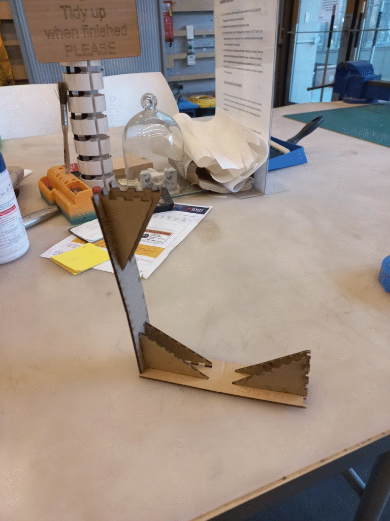
I then laxer cut it out of wood. I removed some of the jagged bits to be less wasteful. I noticed that it was really wobbly and wouldnt hold itself up with woodglue. so I tried adding wood in the corners to stiffen it.

Everything was ready to combine.

I bought a metal pulley from bunnings and hung a small bar for it to loop onto. Which was reinforced with extra wood so I could use normal size screws.

And here it is with the sounds I recorded.

So in the WIL form I discuss the flaws of this excersize. But it was working so i made 8 more.

next was fabric sourcing, my factors were budget, weight, colour, and transparency.

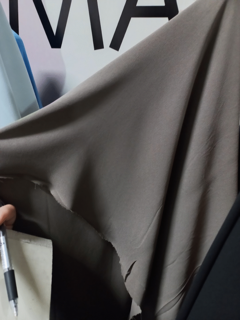
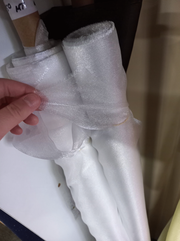
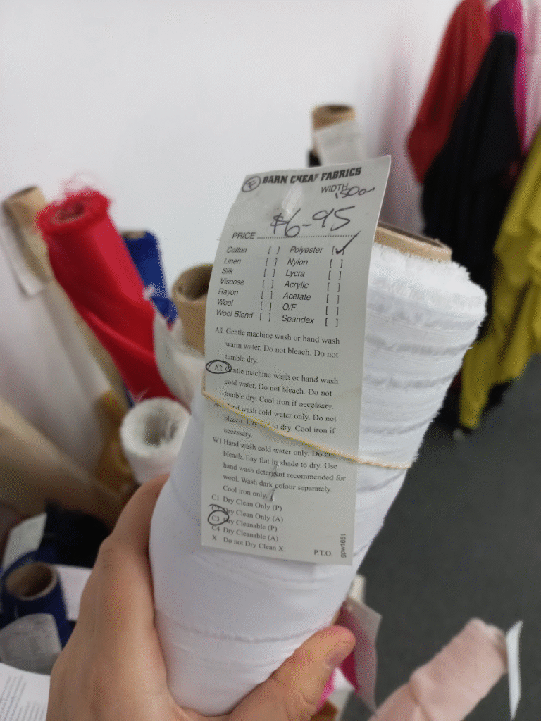
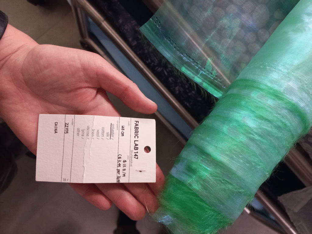
I went to Rathdown remnants in brunswick, and darn cheap fabrics and Fabric lab in Fitzroy. Prices ranged from $7-$14. And i had calculated I needed at least 77 metres to cover the ceiling with some give. Totalling to $539-$1078. Then I found some dark grey lining fabric that was $3 a metre ($231). It was a good cheap option but it was dark and not particularly opaque.

At this point lecturers were urging me to keep the piece simple and ignore the music portion of the piece. I was struggling to write lyrics or find time to write music since this tech stuff was so complicated. So I opted to show the cycle portion of the piece in a different way.

I still wanted music, so i decided to “infuse” the human element of it by recreating the sounds of a rainstorm using only my voice. In a folky choral way.


Here are the recordings I made for the different parts of the piece, I didn’t get to edit these since I had to pivot again later on and this part became redundant 🙁


Instead of having the motors forming in a square grid (which i thought looked like hot cross buns) I would have them in a circle. This meant that i could do much more fluid and obvious circle motions and sweeps.

With this dilemna with the fabric price it also meant that I could possibly have 2 different fabrics. The circle being one and the outside (that would be sewn to the circle and then pinned to all the walls) could be the cheaper and darker fabric.

I made a small scale stage of the drawing studio and then tested the idea with samples of the different fabrics. I was really drawn to this two tone fabric idea. A fun consequence of this meant that the two different fabrics had different opacities, where light would be blocked by the outer fabric and shine through the inner fabric. This would be another dramatic highlight.

At this point I had discussed with Andre about installing the piece in the drawing room… ooft, this was difficult. A lot of what I had planned was not possible. I had created my pieces so that i could sit them on top of the beam. Andre said this was not an option as the ladder is too short. I also could only put them on one side of the beam, and i couldnt hang them on any wires.

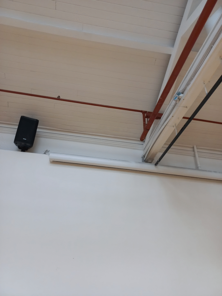
This made things very complicates, I couldnt imagine a way of getting any of the pulley systems to be neat or measured without re-wiring the drawing room ceiling.

The other very scary thing Andre said was the $3 fabric might be considered a fire hazard as it blocks the sprinklers. Other fabric could be okay but because this was tightly woven and could possibly stop water from getting through, it could be not allowed.

The idea of me spending an entire semester and hundreds of dollars on this piece all to be told I can’t the day before the grad show by the ohs inspector was scary.

But I had no other plan so i figured out how to “evenly” install the motors along the beam.

I then began making the circular pattern for the inner circle portion, since there was no issue with that part.

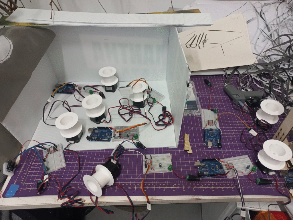
I then started making all of the other computer parts. I tried soldering these onto a circuit board, which is less likely to break, smaller, and cheaper.

I tried for about 2 hours to get one soldered but there was just no way it was happening, it was much too fiddly and time was of the essence at this point and there was also no guarantee it was going to work.

So I just bought more breadboards and planned on hot glueing the wires on, so they wouldnt wiggle out under the vibration of the motor.

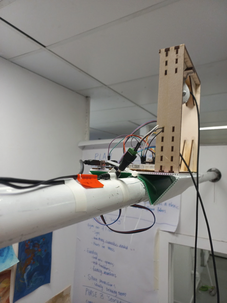
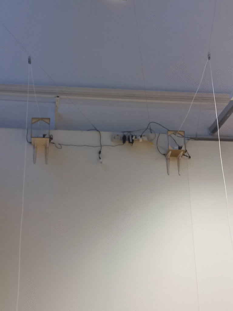
I then figured out how to install the motors on a vertical plane rather than a horizontal one.

I glued an extra layer of plywood with the grain going in the other direction so that it would be stronger and thicker. Because it was only 6mm of plywood I had to use very small screws, `i was worried they could come out so I also glued the brackets on using liquid nails. Since these would be above people’s heads I took no chances.

I also found a different type of pulley, rather one that was fixed. It had a screw in the top, so I had to hacksawy through each one, then make a bolt hole big enough with a drill. This stopped the clanking noise and meant that I could angle the pulley in a permanent way.

construction time!

After many makerspace visits, lazercutting, hacksawing, gluing, clamping, screwing and dremmelling.

I then glued everything onto the bases and started sourcing power supplies for the motors and computers in each device.

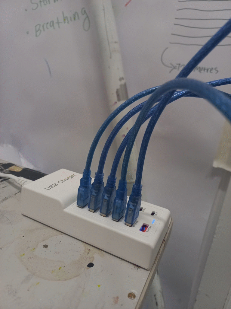
One of my plans to sync the motors is to physically turn them all on at the same time, which if they are on a powerboard should be okay … I havn’t tested this so I am not sure. But I found this power board with the right amount of plugs.

then the next few days before the group tute I was trying to figure out the syncing.

Which involves wiring two wires from each arduino to a “Master arduino” this arduino will then send a syncing signal set from a timer, so that everything stays in line.

I couldnt get this working in time. On paper it was simple but I couldnt figure out why it wasnt working.

In my WIL form I explained what went wrong, and peoples reaction to the piece.

So I had to pivot.

I movedf to use the same robotics but different fabric. Instead of them being centralised and all relying on eachother I will make them independant, so if one goees wrong its only that one.

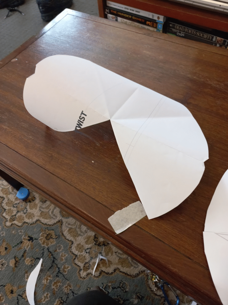
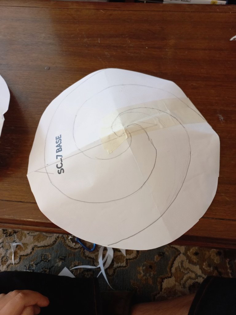
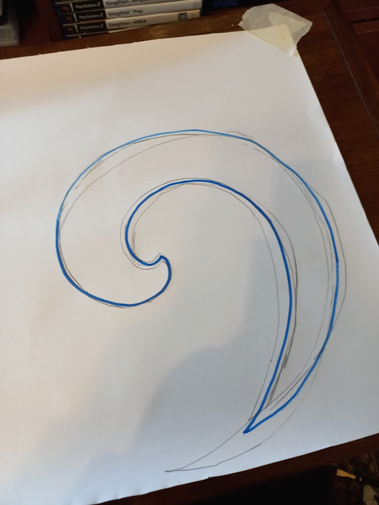
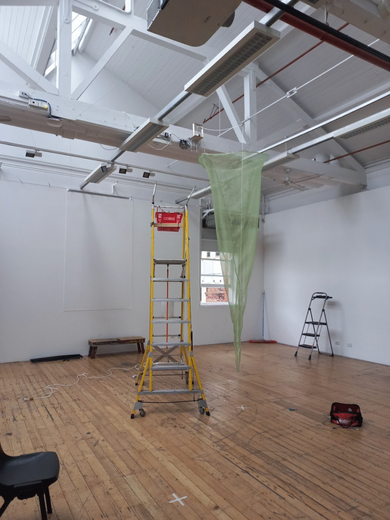
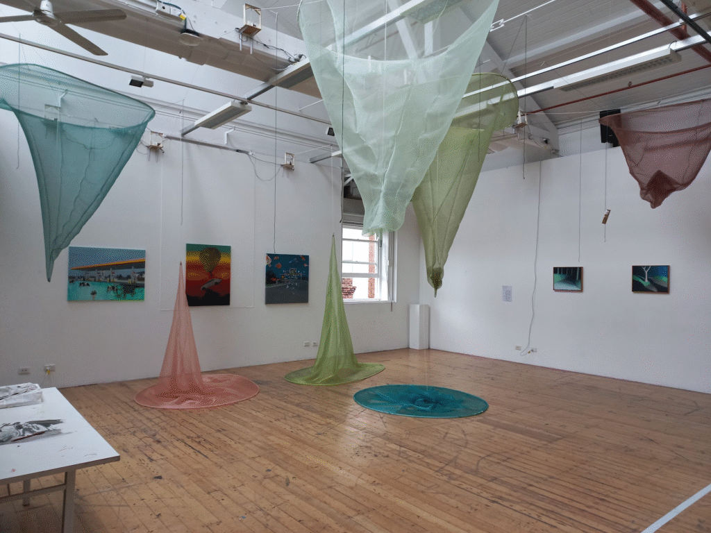
I planned to make these cone type structures that resembled a spiral extended from a flat plane. I wanted it to hang from the ceiling and extend from the floor as if it were stalectites and stalagmites.

I used wire which I wrapped around itself to give it some rigidity since the single wire was much too floppy.

I thought this looked really interesting. I didnt like the pattern it was too long and tubey and now that i am looking at it looks like a weird condom. So I added more fabric so that the top would be wider.

I also noticed that there was a noticible (to me at least) gathering that came from the sewing machine feed dogs unevenly pulling the fabric. I also had to do a french seam to enclose the raw edge since this fabric was very likely to fray. This required so much extra work and made each one take so long.

I talked to some staff at the fabric shops and they said that a copious amount of pins would help. So thats what I did, made 7 more versions with 5 metres of fabric each pinning in 1 inch increments. This took 2 days, and was very labourious.

Luckily i figured out that since this was poleyster organza I could solder the seams and the small amount of plastic melted would protect the seams. This took what would be another 2 day job into a 2 hour job. I wore a respirator the entire time.

Then began hanging up the motors. Each motor needed two power supplies, so I had to install many power boards. From each motor I attached a pulley on the wires in the drawing room. This meant I could centre the spires on any point as long as there was a wire. I went for a random naturalistic arrangement, makeing sure there were differring heights and also a nice colour balance. I went for this colour pallette beacuase i wanted it to feel naturalistic but not sterotypical, so I gravitated towards colours that would be found in the Australian bush and oceans.

When I installed them I had issues with the counterbalance. So I sourced some bolts and put them around the string. This worked excellently. I also had an issue where the tip of the spires where being caught on the fabric, I tried strengthening the tips with fishing line, looked into using wire. But I figured out that if I sew the edge of the fabirc near the bottom to the cord it wouldnt invert and get itself stuck. Which was a great solution because it was quick and I didnt need to buy anymore things.

There were a few issues the night before the install, I realised one of the motors was underpowered and wasnt working. So I found a power supply that had more amps. One of the machines had a physical probem where the spool was rubbing against the stand, so i jimmied it out the way and it began running again.

I coded each motor for the slightly different heights they were, and the speed they were moving.

Because speed and pitch correlate, the ones I coded to be faster had a higher pitch and the ones coded to be slower had a lower pitch. This resulted in a beautiful harmonic symphony !!! Everyone told me to keep the machine noise, I am glad that I listened to them (apart from some minor adjustments, which makes for the sound to be more beautiful)

https://youtu.be/abjw_DbGtaI

https://youtu.be/abjw_DbGtaI

I am pretty happy, I worked my butt off on this and dont think I physically could of spent any more time on it. There is a lot of things that happened that I havn’t included here because it would have taken too much time. A lot more failures I am too sore to discuss.

This is a piece I am incredibly proud, almost every facet of this is out of my skill level and I had to do a lot of learning and “its about the journey not the destination” mantras. That being said, the final piece is captivating and gets people to look for an extended period of time, which honestly is a pretty big goal of mine. I think I could work on some of the sewing elements, I really should have ironed it or at least steamed it. For the gradshow I will definitely be doing this. I think this is a great first baby step into the big wide world and I am excited to make more things, so `i can look back on this as a time capsule of my skills.

Here is some of my research and coding trials.

Semester 1 2025 – Studio

For the start of this semester I was a bit lost I had lots of ideas but i didnt know where to go with any of them. I started as I always do, by doing a brainstorm

the key outcomes from the brainstorm where:

  • would love to expand my musical repertoire
  • would like to focus on the juxtaposition of the immensity of the world and the minutiaea
  • excited to work in many mediums, video, sound, projection, print, spoken word, writing/poetry
  • nature
  • being honest, unpretentious, and accesible to non art world audiences

Truthfully i then got quite overwhelmed with pressure (mostly self inflicted) and with some great free counselling from the uni, finally started getting somewhere.

I decided to try my hand with words an element in art I enjoy. In my process I would try and find something that was distressing me or found interesting and write everything about it until i said something that could be considered noteworthy. These were good brain storm sessions to get interesting angles and ideas flowing. I also had the intent of using some of the words as lyrics. or atleast a starting point for them.

in the same vein of generating ideas/angles/aesthetics I created a process for my music making. I am slow at this side of the art world. I feel visual I can come up with interesting things in my sleep but musically i have been working lots to try and get something sounding good, not so sure i have achieved that. but it is all about the trial and error, and for me I spend lots of time in the error stage.

I started with some small musical experiments “noodling”, creating sounds from a synthesizer and then playing what feels right.

dont feel the need to pay too much attention to them, imagine they are the scrappy drawings in a thick sketchbook. The intent is to warm up my ears and start getting the hang of making so i eventually can be critical and grow.

This one is a collection of synth noodles.

This one I my pallete was unconventional drum sounds, i attempted to slowly change them throughout the piece.

this was another beats practice, where it changes each bar.

Now i got myself into a pickle. I really wanted to give vocoding a try, inspired by musicians like Laurie Anderson and Bon Iver. It took me a couple of weeks to figure out, with almost no success. I was trying to figure out how to use it so i could play it live, in the hopes of being able to do a live performance at the end of the semester. No such avail.

I found the interface really glitchy and also the actual sounds were hard to manipulate into anything other than completely spacey. If i want to get something presentable from that technique I would need a lot of fiddle time. Which i didnt have so i pushed that to oneside.

I collated some of the sonic noodles and word noodles and created this

I found this hard to work on, its not very interesting and i recorded it in free time which meant putting it in time to work on it and sing to it would be a lot of work.

I decided to start thinking about my art as a transportation. I wanted the viewer to feel transported within the music. but on of the most exciting ways to do this is with installation work.

I then had a brainstorm.

my plan from then on was how to make video art interesting spacially without it looking like the Lume, https://www.grande-experiences.com/permanent/the-lume-melbourne . Which I personally have not seen but has been described to me as seeing a large screensaver.

I wanted to keep to a nature theme, but also wanted to project without it be projecting out onto walls. centralising the projections, and creating many angles so that someone could move through the room and get a different experience.

i was thinking about the spaces between tree branches. this is when i had the idea to project onto fabric hanging off of a tree.

Next step, finding a tree!

this one was pretti perfect, it had been accidentaly coppiced by the council since it is under a powerline. The other trees this size were only 2-3 centimeters thick.

I cut this down and then carefeull cut all of the limbs off. I measured the boot of my car with the seats down and figured I needed to shorten it about a foot. I then got a large drill bit and drilled a hole where each limb was. I then wittled down the branches so they could fit back into the hole they were from. this took many days of fiddling and labour as it had to be precise enough so they would fit and be safe. Lots of whittling.

I had some spare white cotton fabric just to see if the fabric would be interesting to lok at or lok like laundry on the line. I think it looked okay.

I then went fabric shopping to Rathdownes fabric, were I was specifically looking for some semi-translucent fabric. I wanted it to appear almost like clouds, and for the projections to overlap slightly.

This is where I was also testing how to position the projector. I borrowed the mini-short throw projector. I put it on its side with a little angled mount I made out of corflute.

I then attached it to a christmas tree stand to keep it upright. everything worked so i drove it to uni. (i went in the service lane and it was so scary driving in the cbd)

Tree in my studio! It just fit and was being pressed up against the walls. This was quite exciting, particularly since people really like looking at it. If it is bizarre enough to be considered a spectacle at least people will look at it. I did find people very happily would just stare at it and all it little details.

My intitial plan was to have one projector per panel and I was to have around 6 panels.

Turns out AV loans only has two of these projectors.

video of a dusk I filmed from my bedroom window

I bought 6 metres of this white polyester chiffon, for $10 a meter. very good deal.

I measured and cut the fabric, careful that the grain of the fabric stay horizontal to the ground. I cut along the curve of the limb and momentarily fastened it with tape.

This is the tree in its “Ikea” form, so that I could get it in my car and through doorways.

I was able to get three panels ready, with two mini-short throw projectors and then a regular sized short throw projector.

I put it up in the drawing room for the group presentations. I regret to say i planned to sew the fabric to the tree but then i found out there would not be very many students coming to the tutorial so I didn’t. Turns out the lecturers were all free so I showed Peter, Ruth, Ian, Adele and later at lunch Mikala. They all said the tape was ugly and I felt very silly.

Sand bags were required as without the support of the studio it became a bit lopsided.

I had three projectors going all sitting on the ground on angled mounts I had made out of corfelute. People could walk completely around the piece with the help of some cable covers.

I then had the group tutorial, which is written about in my WIL form.

The group tutorial I would say was hard. There were obvious issues (tape and stand) that were addressed. I also felt the theme wasnt as clear as people had their own idea and just ran with it. My intent was for it to be a fractalisation of perspectives through the lens of living with nature. This is not what people were talking about, they said things about it being boring or frankenstein-y abomination. I chatted with Mikala after the tutorial and I wasnt sure whether i drastically changed my piece so that people would get the exact idea, or i stick to my guns and refine the piece so that it is clean and how i originally intended. But we figured out that one of the things I cared about was people having their own opinions and reactions towards the work — to be more open-ended.

So I went on the path of refining it, people can go in their own directions and its not really an issue. If I do it well it should be more of a phenomenological response anyway.

For the group presentation I had only filmed one dawn, so all the videos played one video. This isnt what i wanted, but i could only record one at that time. My intent was too show multiple, hopefully getting one for every panel. I then spent 5 more dawns filming all of which was for nothing, none of them were good enough to use.

I even drove to a different location, but trees were in the way. So I ended up getting my mum to film a dawn in West Australia where she works, much more sun there.

I wanted to change how i projected the dawns as having the wires on the ground alluded to some sort of wire/root connection as well as looking messy. So I was trying to figure out ways to bring the projectors in the air.

This was perfect as it meant the room was completely walkable and there was no safety issues.“` It also meant that since the projectors were at a greater distance the image was bigger and I could have larger panels.

I then had to figure out how to do mapping. I previously have done it on MapMapper with a free trial, but for this project I needed to learn how to do it on After Effects.

This is me learning how to set up the masking.

this is a video of my thoughts trying to figure it all out.

This is when I had a discussion with Michael and Faiza, where we figured out that I could hang two projectors on the rigging in the video studio and a ledge on the opposit wall, using a magic arm and a clamp.

I should mention one of my inspirations for this piece, and my commitment to creating a space was from my enjoyment of seeing Pippilotti Rist’s work Lungenflügel. I lay there for almost half an hour watching the video multiple times with my cousin, just seeing the world from a different perspective. Childlike my eyes followed the colours and the movement, I happily went on the journey having no idea where I was going. This state of exploration and calm was something I wanted to explore within my own work. So it was important to me that the work was somewhat seamless so that the creation doesnt need to be questioned and rather can just be taken for granted.

From this day I also figured out that I can only do the masking once everything is set up in its final position. Which means I would have to do it all in one sitting.

So I booked all the gear and booked the whole day in the space for the day before assessment.

Final set up

I then spent the next couple of hours cutting and sewing the fabric with fishing line onto the tree. I wanted it to like a bit magic, as if it was just growing out of it or it is a trick of the eye.

I did do a trial of including some stones, so that it looked like it was growing out of the stones. But it looked silly and there wasnt enough so I ditched that, and then spent 30 mins cleaning it up.

I opted for a half natural half real stand, where i dont hide the actual base but there is am almost magic possibility that it did grow out of the ground here.

It was then time to set up the projectors!

I started getting the tree ready for the day. I had driven into uni the night before and dropped off some branches to drill into the tree. Since the tree was so lop-sided. Just to fill out the space a bit more and for it to make sense from all angles.

For the base, some of the critiques were that it didnt look professional. Which I did agree with. So i thought of a few different types of bases I wanted to create. But I then realised a secret component of the work was the desperation of the artist to show people. The effort and the difficulty and absurdity of doing this is part of the work. Making a completely clean bass would remove that element of the story. So I decided to keep the christmas tree stand.

with some leaves from the tree and some moss from my garden.

while i was programming the masking i plugged in a long HDMI cord. For the final edit I exported the data and put it onto 3 seperate usb’s, unique to each projector position. Each projector loops on its own. there was no easy way for me to sync it so i set them all up and then ran round the room and clicked them all as quick as I could

Each one was edited differently with different videos. Because I had two dawns filmed and six panels, I cut each video into 3 vertical strips.

The last was the music! I initialy wrote a 30 minute song that would be the exact time as the video, but i realised it would take hours for me to master and pan to be interesting in the 5.1 studio.

Screenshot

so I wrote a shorter 8-minute version that was easier to manage.

Screenshot

It has three sections so as the room lights up the music follows.

I created each sound using Mini MOOG model D

Screenshot of DAW interface

for each section i split the high and low notes and then panned them using the surround sound panner. So the music moves throughout the room, around the tree and the viewer.

Reflection

I am very proud of this piece, it required a lot of finesse in technical components which is something i think has taken me three years to get to this point of capability. I am happy with everything physical with it. I dont think the music matches as best it could, but that just came down to time and working on a piece that is half an hour would probably take a good few weeks. I am also very happy that this piece was very independant, my dad taught me how to use a chainsaw and then from then on everything physical or technical I figured out.

I am worried about the conceptual side of it, I think possibly, it ran away from me a bit. My intent from the very beginning was for it to have an affect on people, a phenomenological response. I wanted people to feel. Feel weird, or disconnected, calmed, or seen. I find it challenging to discuss academically. How can i prove that taking something out of its environment and putting it into a gallery setting is meant to make people feel discomfort or yearning or memories. Thats not up to me, so i just have to trust that it will work for people.

Project 1 – Continuous time

I have made many pieces that are intended to loop. I have often found finding a piece in a gallery that is halfway through incredibly annoying. Getting half the story without the context and then watching the resolution without the proper build-up.

I wanted to try and create a perfect loop for this piece, so I was looking for ways to do that without having too much of a glitch.

so I was thinking of mechanised things

  • bicycle
  • blender
  • sewing machine
  • escalator

I ended up choosing sewing machines as it is one of my favourite hobbies.

I also wanted to reference invisible labour and how that has changed through mass industrialisation. When a mother used to make most of the clothes for a household, now unseen hands in far-off lands do. Most people believe (and I did at one stage) that most clothes are made with automatic sewing machines where people are not involved.

That is not true,

Every item of clothing is made by hand, and many people have touched it before you.

I was also inspired by this artist

Femnet e.V. x HUMAN TOUCH

at Rautenstrauch-Joest-Museum Cologne

It is a performance piece in which the artist applies black ink to their hands and starts making garments. The end products are completely marked up, showing how much time and humanity is put into each garment of the billions the world uses and throws away.

I set it up with a tripod, a desk lamp and then the sewing machine on my desk.

I cut a long strip of folded-over black fabric to try and hide as many artifacts as possible that would ruin the loop. I ducked under the table, held the fabric, and pressed the foot.

I couldn’t perfectly match it up, which was quite a pain as the black fabric slipped around a bit. Because I was ducking to get out of the shot, I did not have that much control.

Project 2 – Soundtrack

When I think of a soundtrack for a piece that continues into infinity, I think of arps. I am a vintage synthesizer fiend, which has altered how I understand the construction of sound and music. I have been lucky enough to make lots of music with this synthesizer: the Moog Model D. It is like a language I have learned (so you will see me making lots of music with this)

For this specific project, I used a different synthesizer: King of FM., a type of synthesizer that plays two synthesizers simultaneously. Whilst still being able to alter settings for both synthesizers.

So, I combined a Marimba with a synthesizer called Metamonics and then adjusted the release and decay of both to make it sound snappy and plongy.

I then altered the sequencer.

Each number indicates a variation in semitone from the original note hit (on the keyboard). So, it plays its song/sequence by holding each note, which is fun to play chords with as the notes harmonise and jump from location to location as my fingers do.

Also note that it is 10 steps long.

I wanted the arps to get chaotic, so after two bars, I decreased the number of steps by 1, so it feels like it is getting quicker. After going down to just one step, I tried lots of different steps to keep them sounding in time, so I didn’t choose many odd steps.

The number on the sides indicates how many steps it is.

I also wanted a quick and snappy feel that relates to the snappiness of the sewing machine.

I think I could develop this concept, as I find it interesting. However, I don’t feel inspired by making this kind of art; it feels too methodical and obvious (even if I didn’t do as good of a job as I would like).

Project 3 – Archival video

I wanted to try something with modern footage because anything I try to make with old footage tends to be quite cliché.

I like the Internet trash aesthetic. It is often very unserious and feels like diving into an unknown realm. I also like that calling it art makes my old art teachers squirm.

I was inspired by this artist

IF WE DON’T,
REMEMBER ME.

IWDRM was a blog of animated movie stills active from 2010 to 2015.
A video installation was shown in exhibitions at the Contemporary Arts Museum (Houston, TX), &FOAM (Amsterdam) and The Event (Birmingham).

I like their reappropriation of film stills, turning them into whatever outcome they want.

I also like the visual aesthetic of Cory Arcangel

I especially like how everything feels kind of crusty or corrupted.

For my piece, I was inspired by a Twitter post that overwhelmed me with joy, sadness, and humility.

I wanted to harness the emotional energy that films are known for and combine different types of content. Film is high-budget, with thousands of people dedicated to a single project. It is high-class. To a tweet: low value, low impact, low resources.

While also trying to reference the crunchy garbage aesthetic of internet artists and what is often connotated by people who spend too much time on Twitter.

I found this website, on which if you type in words or a quote, it will find that from a movie (that has been added to the archive).

https://getyarn.io

I couldn’t fully find exact quotes for the tweet, so I added subtitles to ease the transition.

It was a fun project, and I think if I spent a bit more time trying to re-word the quote so it made better sense, the project would be more coherent and might carry the emotional weight I was attempting to key into.

I also think that this is a genre of art and visual aesthetic I really like; it doesn’t excite me to make it. So perhaps a little less love went into this type of art and I doubt i would be making more art like this in the future. although i think this could be done really artfully if i had some more time to spend on it.

Final Project

I started with a mind map//

I was focussing on things that moved me. What I felt had immense weight and importance on a universe and personal scale.

Last semester i focused on activistic art, this semester i wanted to hone in on art that feels intrinsic. I was thinking about the art pieces that have moved me and I will never forget them.

August Friedrich Albrecht SCHENCK
Anguish (c. 1878)
(Angoisse)
oil on canvas
151.0 x 251.2 cm
National Gallery of Victoria, Melbourne
Purchased, 1880

First time I saw this work I cried and it haunted me for days after, when I ever had a spare moment I was emotionally overcome.

I felt it conected to something so primal in me. Specifically the phrase and emotion “its not fair”.

Sun Yuan and Peng Yu: Can’t Help Myself. 58th International Art Exhibition, “May You Live In Interesting Times”, La Biennale di Venezia, Central Pavilion, Giardini. May 8, 2019.

This piece also made the rounds on social media, and for me it was about the questioning of creation, purpose, and intent.

I also found this incredibly interesting as so many people interpreted it differently to what the artist intende, often ascribing personal details towards it. It is actually referencing the chinese government obfuscating its harm for the public eye.

22, a million – Bon Iver

This is another piece that if i listen to it I will cry. (I also just cry a lot, artists have sensitive souls).

For me this album is about disconnect and distance, whilst understanding the beauty and the need to cherish relationships. If they are going or gone.

I know that all of the pieces are quite sad; I think it’s hard for artworks to feel important unless they have a degree of emotional turmoil. This is a bias I am aware of in myself; I am still working on cherishing work that isn’t always like this.

What I want to take away from these works is the intense emotional energy. However, they are also deeply personal, and the viewer decides how to experience the piece.

The results of the Mind map:

  • Non-human time is wicked cool. Trying to elicit a glimpse of an understanding of what that means, like when you learn how old the planet is or how small it is in the scheme of the universe.
  • Dancing. The music compels people to move their bodies! It’s like magic.
  • Masks are weird, they make people uncomfortable… why?
  • Deep ocean feeling (I love that place)
  • whales! They are so smart, and we don’t even know how smart! Also, they have a language, and we are trying to decode it.
  • Creating an environmental space through sound.

I decided to make a sound piece because music is such a wonderful tool for expressing emotions. Also, sometimes film can be unrelatable, so people aren’t as quick to attribute their own feelings to it (e.g., I will often have to be the “main character” because I can’t find anyone else to film, we end up attributing our cultural biases to the piece. I would like to make that neutral). It is our innate response to music. I intend to capitalise on that.

Sonic inspiration

I think it is fair to say that I have a rather broad music genre interest. I will only mention work that I think is relevant to the direct sound inspiration to this work.

For this work I was inspired by pieces with heavy digital manipulation, that don’t necessarily follow a regular music structure (but often they do).

Hide and seek – Imogen Heap

This song is absolutely haunting. What I find most beautiful is the multi-layered gated voices (meaning at certain levels (created by how loud she sings), different amounts of effects will be triggered)- something very cool and something I would’ve tried for this piece if I had more time.

Another piece to do this in a similar but different way is Bon Iver, from the “22, a million” album.

The effect of the layered voices feels so powerful. and because they are all the same voice and triggered from the same sample it feels like the many facets of a single consciousness of a mind coming together. A choir of the self. It feels amazing to sing along to, if you learn the words.

ahh yes, a classic.

The regular motif of the “ah” repeats throughout the entire piece, staying constant as different emotions are called to by the smaller sections of synth that change throughout the piece. Guided by the simple and far-off lyrics, the piece promises different lives.

This piece also has edited vocals with a computerised lush texture that I would like to recreate with my synth.

And now for something specifically synthesiser-inspired. I love Kraftwerk’s entire discography, but this song floats around in my head more often than most. The manipulation of sounds, varying textures, and melodies stacking and flowing through each other is just awesome! It sounds different every time you listen to it.

I really like Kraftwerk’s attention and dedication to the synth. I also like the fact that none of them knew anything about music; they just did what sounded good. That is currently my Modus operandi.

Here is a contemporary example of a song that prioritises digital augmentation for emotional output. I get very sad when I listen to this.

Suzanne Ciani – The Velocity Of Love

This artist uses similar synthesisers to me, and I find myself un-intentionally using them in similar ways. like the pads that create an expansive space.

Kaitlyn Aurelia Smith – Log In Your Fire

here is another example of an artist who combines arps, pads, and samples to create a lush soundscape.

This is me trialling the use of an analogue synthesiser. It is also a good way to understand my music-making process, how I affect the sound, and how I play.

This is a Moog Voyager, which is a later version of a Mac plug-in that I used. So, I was familiar with most of the settings.

I chose not to use an analogue synthesiser because it is monophonic. I could only play one note at a time, which musically is quite limiting and not what I wanted to do for this project. I am a fan of chords and playing two notes at the same time.

I started with a synthesiser plug-in.

This is the synthesiser I learned on, so I know what every button or dial does and what to change if a sound doesn’t sound right to make it what I can hear in my head.

For the main sound of the synthesiser I focused on editing these elements (from left to right)

  • Three oscillators are working at different lengths (32′, 4′, and 16′). This creates that really large and cinematic sound, as when I play a note, it triggers three different notes.
  • I included three different waveforms (a full saw-tooth, a half saw-tooth, and a square wave). I find a saw tooth sounds more like a flute tone (sharp and spikey). A full square wave sounds kinda like a fart, which is a good thing. This sound is good for bass or scary things. When I combine these three, it makes a luxurious, rich texture.
  • I turned off noise as I didn’t want the sound to become foggy at all.
  • Then I altered the filter, contour, and cut-off frequency so that it would distort slightly and then resolve in the time frame that I wanted to play the music (if I hold the key for 4 seconds, I would like it to resolve in that time, but I wanted to play quite slowly so I made it higher, 6-8 seconds)

This is a different type of synthesizer I used

It has a sequencer, so when I play one note or a chord. It will play all these notes in a timed sequence.

It is also special because it plays two synthesisers simultaneously, and you can edit each level.

I chose this synth because it had a different texture to the first “demon pad”. If the textures feel the same throughout the piece, it feels fatiguing. I liked this one because it sounded like church organs and was grand. I altered and extended the sequence steps so the rhythm would feel gradual and less dancey.

I also chose the third instrument, a wood marimba, to include a different texture. It also sounds different because of all the air between the notes, which is in direct contrast to the other sounds.

These were the many different sounds and melodies I tried and did not use. Often because they weren’t interesting enough, or they wouldn’t hold up against the other sounds that I had created.

At this point, it was just stereo. I wanted to spacialize it into 5.1. I want the sounds to envelop the listener and move around them so they feel transported, and the sound waves completely envelop them.

I showed this to the class for a check-in and got good feedback. The most common feedback from everyone was that it should be longer. And I agree.

I had been working all this on Garage Band, which I do particularly like. But it doesn’t export in 5.1, so I have to change to Logic Pro. This is quite a challenge because most of the plug-ins I have been using don’t transfer over to Logic Pro. Also, I can’t use any of my plug-ins in the school’s immersive room. So, I have exported all the midis as audio files and will transfer them to Logic Pro to spatialize them.

I extended the initial sound bath section to 4 minutes.

I then wanted the different notes of the chords to move around so they could swish around in unexpected ways.

I played this live and then recorded it, editing sections by cleaning them up and rearranging them to create emotional tensions and releases.
I split them into four tracks, depending on their position in the chord. I then exported them as individual tracks.

This shows the change in angles of the round 5.1 spatialized surround.

This shows the wideness of the sound (sometimes encompassing 1 up to 5 )

These are the volume levels. This took lots of careful consideration, even more so than spatializing the sound. I focused on keeping elements in check that told a story, but if it was too loud, it overwhelmed the listener. There were lots of elements like this; I felt like a conductor.

This is the song that I used for my class tutorial, and here is the WIL form.

So, from this and also being able to exhibit it at the photography event, I was told that people sat and listened to my music in the dark, which is incredibly brave of them, and I am immensely thankful.

Then I moved onto the final edit

I lengthened the Kalimba section, but I didn’t make it as long as the other two sections, as I wanted some variety.

I then split the organ section I had written into 3 parts so that I could move the chords around. I couldn’t do it completely, as how many notes are played at once changes how the arp sounds. So, to not make it too muddy, I just used the lowest notes.

I then exported them all as audio files and moved them into Logic Pro to spatialize them in the immersive studio.

Once I moved them into Logic pro, I cleaned them up a bit and got the timing between the sections neat then I spatialiZed it.

This is how I control the movement of the speakers.

Once I had cleaned everything up.

I exported and it is done!!

I am so proud of this work, which is rare for me. I feel I have hit all the marks I had intended to.

  • An interesting-sounding piece
  • a piece people feel things when they listen to
  • a sense of space or environment, without having atmospheric cues
  • something people enjoy
  • something I haven’t heard before (for me at least)

Here’s an artist statement based on your guidance:


In crafting this piece, my goal was to immerse the listener in a transformative experience, using the evocative power of synthesizers as my medium. I believe that the most profound art taps into fundamental, primal emotions, transcending intellectual complexities. My aim was to create something universally relatable and engaging, irrespective of background or status.

Music, with its ability to elicit both physiological and emotional responses, became my chosen vehicle. I sought to evoke a sense of profound movement and emotion within the audience. The piece unfolds in three distinct sections, each exploring different emotional landscapes, tensions, and energies, akin to movements in a symphony.

I am delighted by the resonance the piece found among listeners, who described feeling physically transported and deeply moved. Their reactions affirmed my original intention—to create an auditory environment that speaks directly to the soul, without relying on literal environmental sounds.

Moving forward, I am excited to further explore the concept of movements within music, deviating from conventional structures to craft a narrative that guides listeners through varied emotional terrains. This journey aims to transport them to a place beyond the ordinary, where music becomes a powerful conduit for shared human experiences.

I am immensely proud of having created something I have never done before using equipment I have never used before.

I hope you enjoy listening to this piece, I think this is the beginning of a road I am excited to continue travelling.

Project 1 – Worthless object

For the worthless object task, I was given the buckles from a pair of overalls. I didn’t want to make a sewing project with it because I didn’t want to introduce any new materials. So I wanted to transform the metal somehow. Either by bending it or by smelting it in some way. metal crafts are a new hobby for me and something I am still learning.

I thought about things that were worthless, and I thought about things that had a lot of worth. or even what is a measure of worth. So I started thinking about money and different types of money, like all the 1 cent coins my grandma gave me as a kid to use as play money. or bitcoin or other shitcoins that are only made to fool the first couple hundred people who buy them and then the value drops and they are worth nothing. So I wanted to make my own coin as a nod to that, but a physical one, because I haven’t used a physical coin in months. plus I was inspired by this work by. because of how beautiful the mass of them looked together. They looked so tactile and I just wanted to pick them up and drop them to hear the sound.

So i started with a coin made of polymer clay, with the words ‘WORTH ? VALUE’ and ‘WORTH $ VALUE’ .

I then pressed them into some damp sand to get an imprint. which is the traditional method when casting metal.

but the features of the letters got lost in the grains, so i tried again with some clay i harvested from my property.

which came out a lot better, i then used a toothpick to clean up some of the edges (we will see that this was completely unnecessary)

I knew i couldn’t turn the buckles from the overalls into molten metal as the melting point was too high. aluminium melts at 660.3 °C, which i thought was achievable in my forge as i have been able to bend steal with it. so i tried to melt some aluminium from a can.

I made a little wire contraption to hold it up.

This is what the aluminium can ended up looking like. funnily enough, it is still worthless, but not the kind of worthless I was going for.

So I went back to the chopping block because I had a group tutorial and couldn’t show some metal scraps.

I cut it up to have a better chance of melting.

I didn’t have a crucible so I used an unglazed ceramic.

except this didn’t fit in my forge, as I had made it only to fit knives.

so I swapped it to a steel lid of a steel bottle.

It did not work, I could get the metal hot enough to go yellow but not hot enough to melt and drop. also every time I pulled the little crucible out it would cool almost instantly. so I guess that’s why they use ceramic ones.

These plagues my social media and I would say most of these are terrible and a waste of plastic to create. So I wanted to create some fake ones.

so I went to my favourite AI image generator, MidJourney.

this was my prompt ‘pen attachment to hold lid, plastic, advertisement‘ and the result

pen attachment to hold lid, plastic, advertisement, useless

The goal was to make something useless with the most plastic.

these are two standouts.

I feel these encapsulate what i was going for. so much plastic, completely useless. but aesthetically appealing enough that you are almost tempted.

I tried a few more prompts

remote control plastic dust cover

Loved these, the prompt for the first one in no way did I mention wanting religious imagery. But somehow here it is. Ai is weird like that, it has a preference for certain artistic aesthetics.

Project 2 – cut and paste

For this task, I brought in ‘unique cars’.

I also brought some glitter and coloured textas to doodle on top of these.

I really like the feminist history of collage, and how it was often made for small circles. Or even personally.

2 things I wanted to focus on when making my own collage. Interesting juxtaposition in texture. I want it to feel rich but not overloaded. I often find the ones that have full images, end up all looking quite same-y. I also wanted to make it a bit silly, I wanted.

I decided to make a poster that I would imagine hanging up in some child’s bedroom. The same way girls make posters about film crushes. but about cars instead.

this is the whole piece; all of it came from the magazine. I didn’t use any base paper to begin with. I used only small text areas, so the large cars would really be obvious.

here are some close-ups

This one is my favourite, so silly.

Especially on the last two, I really liked how the text element was bridged between the background and the car because of the advertisements. it makes it look like the cars belong there, or this is where they came from.

I thought this was fun and cute, personally, I don’t think it is particularly impactful or interesting. nor did I super enjoy doing it. but it was a cool trial because you use a different part of your brain to make it. instead of making something from nothing, you have to deal with and scavenge through what you can find. and I found that a bit too limiting.

Project 3 – cover project

I was sick for this class, so I missed the lecture and had little time to make a project.

Although I did have an idea that turned into my final project.

I was inspired/shocked by all of the large corporation collaborations with this one Kpop group, that had all minors.

here are a few of the collaborations (you don’t need to watch them. They are proof if anything)

coca cola collab

Mcdonalds collab

Apple iPhone (the entire music video was shot on iPhone, and it has heavy product placement )

These were all released this year.

I had an idea to swap out the logos in the McDonald’s video for Rio Tinto, or try and rotoscope the dances out, then put them dancing in the middle of a mine.

But all of these options were quite difficult, out of my skill set and would have taken more than a week to complete, which was the time frame for this cover project task.

So I decided to focus on this theme for my final project.

Self directed- workshop

Exploration and mind mapping

Glitter bullet

It could be a resin bullet and just a collection of them, maybe in a bullet container. Or I could make a video shooting the bullets either in the frame as an ad or just showing how cool they are and describing the military advantages of glitter. Could be a glimpse into modern warfare, covered in dust and glitter. I could bedazzle a gun and then pretend to shoot glitter out of it.

I think what all I can think about is that the combination of war and glitter is a really weird, great juxtaposition.

Gambling in Australia

this is a topic I would like to focus on, and I am not seeing much art on it. And in Australia, it is a huge problem as opposed to other countries; we have some of the worst gambling, pokies and sports betting in the whole world. And my conversations with young men often include talking about their winnings from the weekly sporting matches (as young as 15) Because, in general, AFL and other sports are for families to watch; when you go to games, the crowds are composed of families or smaller groups of people that have bought their friends. It is illegal to advertise gambling to young people in Australia, but because these shows are televised later at night is considered appropriate even if it is family-friendly watching.

I also want to consider the people gambling and the culture around it; they are almost synonymous. If you are someone who can “understand” all the statistics, that seems impressive and cool. When people only talk about winning (because losing is embarrassing), they think it is a closer option than statistically. People tend to have the sense that “but I am different, I am inherently more special, and I have a better chance than other people”, which is nothing wrong with that. That is part of being human. I am not sure that any art piece could convince someone that that is not true, and I don’t think that I would want to.

So here lies the problem of how to draw attention to the Australian problem, whilst knowing that thousands of people and organisations are trying to do this. But how would an art piece become culturally significant or even just relevant? with this widespread and dangerous issue? Affecting youth and old people (pokies)

  • I could make some pokies pants (inbuilt odour-reducing nappies)
  • I could make a huge pile of unsuccessful scratchies or unsuccessful lottery tickets.
  • make a collection of Facebook groups or fliers for a youth sports-bet club
  • I could be boring and make a documentary of youth gambling (interview kids)
  • I could display some of these as ads in local newspaper (Gisborne Gazette)

Kpop x Woodside

I wanted for my cover project to make a parody video of the K-pop girl group NewJeans.

why I choose to cover this particular group is because I find its whole existence unsettling.

  • all members are minors (as young as 13)
  • they are forced to not live with their families
  • they have to drop out of high school
  • forced to get plastic surgery
  • are not paid until they pay off their debts from training (which is often multiple years)
  • regularly work 15 hour days, and when they get home their dorm is monitored with cameras
  • if they don’t agree or want to do something their company is asking of them, their jobs are threatened. i.e “if you don’t get this plastic surgery you wont be a part of the group”
  • And they are incredibly popular amongst young people and children

and this is the part that I want to specifically reference. Because of this mass appeal and especially to children. certain companies that are not allowed to advertise to children are flocking to this kpop group and sponsering them. this includes McDonalds, Apple, Coca Cola. with NewJeans even making a song directly for Coke zero. I find this all incredibly insidious especially when all this information is available to the public yet there has been no major backlash, people are okay with abusing these minors because the music and music videos they are a part of are trendy and exciting. I also wanted to make art on how overt these ‘sell outs’ are and make the most obvious and insidious sell out sponsorship of the Australian petroleum mining company Woodside !

I chose specifically this company and specifically mining companies because they are often sponsors of large high brow cultural establishments such as Opera and Ballet. as a way of showing how civilised ther companies are but also to gain access to certain sponsorship events.

So I wanted to combine these two concepts to create and insidious and uncanny creation, specifically a kpop photo album. Which is basically sold alongside a CD of the album to bolster sales as they often sell for $50. like the one I have included below

This one us a collaboration with the Power Puff girls. so I want to recreate this object with, using AI to make a fake Girl group and try and make it really overt that this is wrong in every way.

I plan on printing these AI photos into a small book, as well as having the ‘photocards’ and stickers that are essential part of these Albums.

For the final piece I think I will make an Unboxing video, which are super popular on youtube. i want to do this so I can contextualise the object more as not many people in Australia are well versed with this cultural phenomenon. I have left an example of one down below (you absolutely do not need to watch it, maybe just zoom through it to understand the format).

Beginning of trials

I have been using midjourney as I find having the two subtle variation buttons for subtle and intense variation are really helpful. it means I can refine it to something I actually wanted.

I plan on using AI and specifically midjourney

Because of the nature of AI I can never get the same face twice from the same prompt. I want the final album to look really clean and believable so having faces that constantly change wont work. I found that if I use prompts such as ‘in the style of a character page, or photo series, fashion editorial’ . i would get many faces that look like the same person.

these are the options it gave me. Number 2 (top right) was the most successful as it actually looks like a photo and the head is turned different angles. I then made 100’s more trying to refine the angles, lighting, expressions and faces.

These are some of the later results

Once I ‘made’ 5 of these ‘people’ I started creating fashionable bodies that i imagine would look good for a kpop concept.

these are what i landed on which i really liked, they looked very fashion forward anreferences ‘tech-wear’ which is very popular in kpop fashion.

the reason i created all the faces prior and the bodies second is so i can try and create angles that match the original faces so i don’t have to distort them. and so they can look consistent throughout the entire piece.

This was my first time ever using photoshop and this was the first result, luckily there are millions of videos on youtube and i plan to get better as that is integral to this piece working.

The ‘Team Woodside”, is because I want this concept to look like a sports team sponsored by Woodside, it will also hopefully highlight the youth element and allude to the fact that they are all underage.

Wil form

This is my second attempt at photoshopping the face, which I am quite pleased with.

Now I will begin creating the final photos.

I began by making a plethora of photos on mid-journey, I then sorted through them and found which photo would match which face best. I found focusing on the angle of the nose was the best key to success.

As Journey makes images at incredibly low res, I upscaled all the photos multiple times. It did do some smoothing but not too noticeable so I didn’t mind.

I then made this set-up to plan how everything was going to go, this photo was from when I had done lots of work and needed to edit it .

I then started editing the photos to get ready for the final magazine. i took some ‘ stickers’ from Pinterest to make it more cutesy and align with the current styles in kpop.

I also wanted to include some physical stickers, for the album unboxing. as this is a staple in all kpop photo albums. but i have no ability to make convincing stickers, and if i were to order them it would take too long to be delivered. so I ordered some stickers online, then took the digital version and ‘”stuck” them all over the album so they would look liked they were made for this album. instead of the other way around.

I photoshopped the images on the same page so i could make them look good together when they are folded flat. for example

This page is a ‘get to know’ page and shows personal information about the members. I took this directly from a group, and I altered some of the information to make it more insidious. the last or second last quote, is about Woodside.
“Jiwon thinks more woodside means happier communities and Jiwon wants people to be happy” . I tried to write it so it looked like a child could say that, but a child would never say that.

so I made 20 more pages, including a front and back cover (this took 6 weeks). I had planned to get the album professionally printed, but with my timing, it wasn’t possible. I also realised since it is only going to be a prop for a video, the quality doesn’t have to be that good. it just has to be legible and clean enough for the camera.

I then tried to format it into a booklet so i could print it at home, but for some reason all the software that meant to be able to wasn’t working. I think my laptop had recently updated and put all the tutorials i had been watching out of date.

so i figured out the formatting myself (it was very stressful) but i succeeded.

Paper for the win!

This is how the formatted pages looked like.

This took me quite a while as I believed the printer could smell my fear and frustration and refused to cooperate.

once everything was finished, I started on the actual making of the physical album.

I covered the front cover with a clear film to make it look more professional and sturdy.

I then made the box that all of it is stored in using an old cereal box

I then printed out these photos of faces from two of the members. these are photocards, which come with kpop albums. they are often traded like sports cards and can sometimes be sold for a lot of money, depending on how rare the issue is and how favourable the idol is. So i made two using more cardboard and clear film.

I then covered the box with printed paper, and after that with more clear film.

I also printed some text of ‘woodside’ and ‘harmonicae’ and put some clear film on them to make pretend stickers. I think they are very convincing. I wish I had thought of that sooner, so I could’ve made lots. I also covered a cd envelope with some paper and a sticker, to cover up the original cover and to make more cute things to add to the goodies.

I then put all the goodies and photo albums in the box and cling wrapped the outside, then used a hair dryer to shrink it to the box. I found a barcode sticker on an old book and stuck it to the back for some realism.

This was also my lighting and filming set-up. I chose to film on my phone camera as that is how lots of YouTube unboxing videos are filmed, and I think the quality will help hide some of the subtle construction mistakes.

I used the pale chopping board as it is a bit cleaner than my water-damaged desk.

I tried to film it all in one go, so there were minimal cuts. I also tried to read every portion that referenced Woodside, so it isn’t too obvious or on the nose. It is still almost believable.

I wrote some music for this video, but only 2 minutes worth. So I used instrumentals of other K-pop groups, which is something that is normal in other unboxing videos.

The little green portion is the music I wrote.

And tada. my final piece. I would like to think you found it on YouTube after listening to some pop music and found yourself transported to another world. (yes, it is meant to look a bit dodgy. The video is meant to look homemade. But the book is professional)

What was successful?

  • I was really impressed with how good the photoshopping of the faces looked; that is something that took me weeks to get good at, and a lot of the previous versions didn’t make it into the final cut. Although I will say some of my earlier ones in this aren’t as good as the ones that came after.
  • all of the pieces that came with it looked so cute. Using pre-made stickers was such a good idea. And being able to link them to the photo album by using the PDF version. It created a really seamless connection.
  • I felt all of the colour stories and visual cues translated really well across the entire album. That is something I could only do near the end of the process when everything was properly formatted.
  • I am really proud of myself that I could make something I have literally never made before and do an incredibly sufficient job. Especially since I did it alone with no guidance. I learnt Photoshop from scratch, and I invented a way to create the same consistent faces in mid-journey. I was a graphic designer for a couple of weeks and made an entire magazine by myself. It was pretty cool being able to say every single thing in this entire project I created on my own.

What could be improved upon?

  • Truthfully, I don’t have too many qualms with this piece. I feel I achieved what I set out to. Honestly, it is probably better than what I thought I could do. The things I don’t like are small little things that, if I had a little bit more time, I probably could complete.
  • Some of the shadows on the faces were wrong, but I figured out how to remove shadows. But adding them was a bit too hard.
  • I think I could have added a few more official details to make it look a bit more realistic. Like ‘printed in China, using this ink’ ‘with permission by Woodside and blah blah.
  • I think some of my font choices were a bit weird. but I struggled so hard with the font. Graphic designers do not get enough credit
  • I quite liked the song I wrote, but then pairing it with the other real songs showed how weak and underdeveloped it really was. Something I would love to improve on next semester. Maybe over the holidays as well, as it takes so much longer for me than visual activities.
  • The one major thing I fear I have done wrong is that I was too subtle with the woodside references. I wanted the piece to feel like it could actually be real, and the audience go, “Wait, really… did they do that??”. but I might’ve been too subtle in not insinuating the evil intent of why Woodside would do that. I think I am bargaining on, that the audience is somewhat informed. or at least the question, “Why would a mining company sponsor a K-pop girl group?” would be enough of an impact. I think I would be able to tell if I showed a few people that 1, knew about the K-pop world, 2 knew nothing about the K-pop world, 3 knew about Woodside and how mining companies try to ‘culture-wash’ their brand. I would be very interested on what all those people had to say about the piece.