Semester 1 2025 – Studio

For the start of this semester I was a bit lost I had lots of ideas but i didnt know where to go with any of them. I started as I always do, by doing a brainstorm

the key outcomes from the brainstorm where:

  • would love to expand my musical repertoire
  • would like to focus on the juxtaposition of the immensity of the world and the minutiaea
  • excited to work in many mediums, video, sound, projection, print, spoken word, writing/poetry
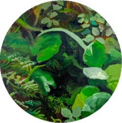
  • nature
  • being honest, unpretentious, and accesible to non art world audiences

Truthfully i then got quite overwhelmed with pressure (mostly self inflicted) and with some great free counselling from the uni, finally started getting somewhere.

I decided to try my hand with words an element in art I enjoy. In my process I would try and find something that was distressing me or found interesting and write everything about it until i said something that could be considered noteworthy. These were good brain storm sessions to get interesting angles and ideas flowing. I also had the intent of using some of the words as lyrics. or atleast a starting point for them.

in the same vein of generating ideas/angles/aesthetics I created a process for my music making. I am slow at this side of the art world. I feel visual I can come up with interesting things in my sleep but musically i have been working lots to try and get something sounding good, not so sure i have achieved that. but it is all about the trial and error, and for me I spend lots of time in the error stage.

I started with some small musical experiments “noodling”, creating sounds from a synthesizer and then playing what feels right.

dont feel the need to pay too much attention to them, imagine they are the scrappy drawings in a thick sketchbook. The intent is to warm up my ears and start getting the hang of making so i eventually can be critical and grow.

This one is a collection of synth noodles.

This one I my pallete was unconventional drum sounds, i attempted to slowly change them throughout the piece.

this was another beats practice, where it changes each bar.

Now i got myself into a pickle. I really wanted to give vocoding a try, inspired by musicians like Laurie Anderson and Bon Iver. It took me a couple of weeks to figure out, with almost no success. I was trying to figure out how to use it so i could play it live, in the hopes of being able to do a live performance at the end of the semester. No such avail.

I found the interface really glitchy and also the actual sounds were hard to manipulate into anything other than completely spacey. If i want to get something presentable from that technique I would need a lot of fiddle time. Which i didnt have so i pushed that to oneside.

I collated some of the sonic noodles and word noodles and created this

I found this hard to work on, its not very interesting and i recorded it in free time which meant putting it in time to work on it and sing to it would be a lot of work.

I decided to start thinking about my art as a transportation. I wanted the viewer to feel transported within the music. but on of the most exciting ways to do this is with installation work.

I then had a brainstorm.

my plan from then on was how to make video art interesting spacially without it looking like the Lume, https://www.grande-experiences.com/permanent/the-lume-melbourne . Which I personally have not seen but has been described to me as seeing a large screensaver.

I wanted to keep to a nature theme, but also wanted to project without it be projecting out onto walls. centralising the projections, and creating many angles so that someone could move through the room and get a different experience.

i was thinking about the spaces between tree branches. this is when i had the idea to project onto fabric hanging off of a tree.

Next step, finding a tree!

this one was pretti perfect, it had been accidentaly coppiced by the council since it is under a powerline. The other trees this size were only 2-3 centimeters thick.

I cut this down and then carefeull cut all of the limbs off. I measured the boot of my car with the seats down and figured I needed to shorten it about a foot. I then got a large drill bit and drilled a hole where each limb was. I then wittled down the branches so they could fit back into the hole they were from. this took many days of fiddling and labour as it had to be precise enough so they would fit and be safe. Lots of whittling.

I had some spare white cotton fabric just to see if the fabric would be interesting to lok at or lok like laundry on the line. I think it looked okay.

I then went fabric shopping to Rathdownes fabric, were I was specifically looking for some semi-translucent fabric. I wanted it to appear almost like clouds, and for the projections to overlap slightly.

This is where I was also testing how to position the projector. I borrowed the mini-short throw projector. I put it on its side with a little angled mount I made out of corflute.

I then attached it to a christmas tree stand to keep it upright. everything worked so i drove it to uni. (i went in the service lane and it was so scary driving in the cbd)

Tree in my studio! It just fit and was being pressed up against the walls. This was quite exciting, particularly since people really like looking at it. If it is bizarre enough to be considered a spectacle at least people will look at it. I did find people very happily would just stare at it and all it little details.

My intitial plan was to have one projector per panel and I was to have around 6 panels.

Turns out AV loans only has two of these projectors.

video of a dusk I filmed from my bedroom window

I bought 6 metres of this white polyester chiffon, for $10 a meter. very good deal.

I measured and cut the fabric, careful that the grain of the fabric stay horizontal to the ground. I cut along the curve of the limb and momentarily fastened it with tape.

This is the tree in its “Ikea” form, so that I could get it in my car and through doorways.

I was able to get three panels ready, with two mini-short throw projectors and then a regular sized short throw projector.

I put it up in the drawing room for the group presentations. I regret to say i planned to sew the fabric to the tree but then i found out there would not be very many students coming to the tutorial so I didn’t. Turns out the lecturers were all free so I showed Peter, Ruth, Ian, Adele and later at lunch Mikala. They all said the tape was ugly and I felt very silly.

Sand bags were required as without the support of the studio it became a bit lopsided.

I had three projectors going all sitting on the ground on angled mounts I had made out of corfelute. People could walk completely around the piece with the help of some cable covers.

I then had the group tutorial, which is written about in my WIL form.

The group tutorial I would say was hard. There were obvious issues (tape and stand) that were addressed. I also felt the theme wasnt as clear as people had their own idea and just ran with it. My intent was for it to be a fractalisation of perspectives through the lens of living with nature. This is not what people were talking about, they said things about it being boring or frankenstein-y abomination. I chatted with Mikala after the tutorial and I wasnt sure whether i drastically changed my piece so that people would get the exact idea, or i stick to my guns and refine the piece so that it is clean and how i originally intended. But we figured out that one of the things I cared about was people having their own opinions and reactions towards the work — to be more open-ended.

So I went on the path of refining it, people can go in their own directions and its not really an issue. If I do it well it should be more of a phenomenological response anyway.

For the group presentation I had only filmed one dawn, so all the videos played one video. This isnt what i wanted, but i could only record one at that time. My intent was too show multiple, hopefully getting one for every panel. I then spent 5 more dawns filming all of which was for nothing, none of them were good enough to use.

I even drove to a different location, but trees were in the way. So I ended up getting my mum to film a dawn in West Australia where she works, much more sun there.

I wanted to change how i projected the dawns as having the wires on the ground alluded to some sort of wire/root connection as well as looking messy. So I was trying to figure out ways to bring the projectors in the air.

This was perfect as it meant the room was completely walkable and there was no safety issues.“` It also meant that since the projectors were at a greater distance the image was bigger and I could have larger panels.

I then had to figure out how to do mapping. I previously have done it on MapMapper with a free trial, but for this project I needed to learn how to do it on After Effects.

This is me learning how to set up the masking.

this is a video of my thoughts trying to figure it all out.

This is when I had a discussion with Michael and Faiza, where we figured out that I could hang two projectors on the rigging in the video studio and a ledge on the opposit wall, using a magic arm and a clamp.

I should mention one of my inspirations for this piece, and my commitment to creating a space was from my enjoyment of seeing Pippilotti Rist’s work Lungenflügel. I lay there for almost half an hour watching the video multiple times with my cousin, just seeing the world from a different perspective. Childlike my eyes followed the colours and the movement, I happily went on the journey having no idea where I was going. This state of exploration and calm was something I wanted to explore within my own work. So it was important to me that the work was somewhat seamless so that the creation doesnt need to be questioned and rather can just be taken for granted.

From this day I also figured out that I can only do the masking once everything is set up in its final position. Which means I would have to do it all in one sitting.

So I booked all the gear and booked the whole day in the space for the day before assessment.

Final set up

I then spent the next couple of hours cutting and sewing the fabric with fishing line onto the tree. I wanted it to like a bit magic, as if it was just growing out of it or it is a trick of the eye.

I did do a trial of including some stones, so that it looked like it was growing out of the stones. But it looked silly and there wasnt enough so I ditched that, and then spent 30 mins cleaning it up.

I opted for a half natural half real stand, where i dont hide the actual base but there is am almost magic possibility that it did grow out of the ground here.

It was then time to set up the projectors!

I started getting the tree ready for the day. I had driven into uni the night before and dropped off some branches to drill into the tree. Since the tree was so lop-sided. Just to fill out the space a bit more and for it to make sense from all angles.

For the base, some of the critiques were that it didnt look professional. Which I did agree with. So i thought of a few different types of bases I wanted to create. But I then realised a secret component of the work was the desperation of the artist to show people. The effort and the difficulty and absurdity of doing this is part of the work. Making a completely clean bass would remove that element of the story. So I decided to keep the christmas tree stand.

with some leaves from the tree and some moss from my garden.

while i was programming the masking i plugged in a long HDMI cord. For the final edit I exported the data and put it onto 3 seperate usb’s, unique to each projector position. Each projector loops on its own. there was no easy way for me to sync it so i set them all up and then ran round the room and clicked them all as quick as I could

Each one was edited differently with different videos. Because I had two dawns filmed and six panels, I cut each video into 3 vertical strips.

The last was the music! I initialy wrote a 30 minute song that would be the exact time as the video, but i realised it would take hours for me to master and pan to be interesting in the 5.1 studio.

Screenshot

so I wrote a shorter 8-minute version that was easier to manage.

Screenshot

It has three sections so as the room lights up the music follows.

I created each sound using Mini MOOG model D

Screenshot of DAW interface

for each section i split the high and low notes and then panned them using the surround sound panner. So the music moves throughout the room, around the tree and the viewer.

Reflection

I am very proud of this piece, it required a lot of finesse in technical components which is something i think has taken me three years to get to this point of capability. I am happy with everything physical with it. I dont think the music matches as best it could, but that just came down to time and working on a piece that is half an hour would probably take a good few weeks. I am also very happy that this piece was very independant, my dad taught me how to use a chainsaw and then from then on everything physical or technical I figured out.

I am worried about the conceptual side of it, I think possibly, it ran away from me a bit. My intent from the very beginning was for it to have an affect on people, a phenomenological response. I wanted people to feel. Feel weird, or disconnected, calmed, or seen. I find it challenging to discuss academically. How can i prove that taking something out of its environment and putting it into a gallery setting is meant to make people feel discomfort or yearning or memories. Thats not up to me, so i just have to trust that it will work for people.

Project 1 – Continuous time

I have made many pieces that are intended to loop. I have often found finding a piece in a gallery that is halfway through incredibly annoying. Getting half the story without the context and then watching the resolution without the proper build-up.

I wanted to try and create a perfect loop for this piece, so I was looking for ways to do that without having too much of a glitch.

so I was thinking of mechanised things

  • bicycle
  • blender
  • sewing machine
  • escalator

I ended up choosing sewing machines as it is one of my favourite hobbies.

I also wanted to reference invisible labour and how that has changed through mass industrialisation. When a mother used to make most of the clothes for a household, now unseen hands in far-off lands do. Most people believe (and I did at one stage) that most clothes are made with automatic sewing machines where people are not involved.

That is not true,

Every item of clothing is made by hand, and many people have touched it before you.

I was also inspired by this artist

Femnet e.V. x HUMAN TOUCH

at Rautenstrauch-Joest-Museum Cologne

It is a performance piece in which the artist applies black ink to their hands and starts making garments. The end products are completely marked up, showing how much time and humanity is put into each garment of the billions the world uses and throws away.

I set it up with a tripod, a desk lamp and then the sewing machine on my desk.

I cut a long strip of folded-over black fabric to try and hide as many artifacts as possible that would ruin the loop. I ducked under the table, held the fabric, and pressed the foot.

I couldn’t perfectly match it up, which was quite a pain as the black fabric slipped around a bit. Because I was ducking to get out of the shot, I did not have that much control.

Project 2 – Soundtrack

When I think of a soundtrack for a piece that continues into infinity, I think of arps. I am a vintage synthesizer fiend, which has altered how I understand the construction of sound and music. I have been lucky enough to make lots of music with this synthesizer: the Moog Model D. It is like a language I have learned (so you will see me making lots of music with this)

For this specific project, I used a different synthesizer: King of FM., a type of synthesizer that plays two synthesizers simultaneously. Whilst still being able to alter settings for both synthesizers.

So, I combined a Marimba with a synthesizer called Metamonics and then adjusted the release and decay of both to make it sound snappy and plongy.

I then altered the sequencer.

Each number indicates a variation in semitone from the original note hit (on the keyboard). So, it plays its song/sequence by holding each note, which is fun to play chords with as the notes harmonise and jump from location to location as my fingers do.

Also note that it is 10 steps long.

I wanted the arps to get chaotic, so after two bars, I decreased the number of steps by 1, so it feels like it is getting quicker. After going down to just one step, I tried lots of different steps to keep them sounding in time, so I didn’t choose many odd steps.

The number on the sides indicates how many steps it is.

I also wanted a quick and snappy feel that relates to the snappiness of the sewing machine.

I think I could develop this concept, as I find it interesting. However, I don’t feel inspired by making this kind of art; it feels too methodical and obvious (even if I didn’t do as good of a job as I would like).

Project 3 – Archival video

I wanted to try something with modern footage because anything I try to make with old footage tends to be quite cliché.

I like the Internet trash aesthetic. It is often very unserious and feels like diving into an unknown realm. I also like that calling it art makes my old art teachers squirm.

I was inspired by this artist

IF WE DON’T,
REMEMBER ME.

IWDRM was a blog of animated movie stills active from 2010 to 2015.
A video installation was shown in exhibitions at the Contemporary Arts Museum (Houston, TX), &FOAM (Amsterdam) and The Event (Birmingham).

I like their reappropriation of film stills, turning them into whatever outcome they want.

I also like the visual aesthetic of Cory Arcangel

I especially like how everything feels kind of crusty or corrupted.

For my piece, I was inspired by a Twitter post that overwhelmed me with joy, sadness, and humility.

I wanted to harness the emotional energy that films are known for and combine different types of content. Film is high-budget, with thousands of people dedicated to a single project. It is high-class. To a tweet: low value, low impact, low resources.

While also trying to reference the crunchy garbage aesthetic of internet artists and what is often connotated by people who spend too much time on Twitter.

I found this website, on which if you type in words or a quote, it will find that from a movie (that has been added to the archive).

https://getyarn.io

I couldn’t fully find exact quotes for the tweet, so I added subtitles to ease the transition.

It was a fun project, and I think if I spent a bit more time trying to re-word the quote so it made better sense, the project would be more coherent and might carry the emotional weight I was attempting to key into.

I also think that this is a genre of art and visual aesthetic I really like; it doesn’t excite me to make it. So perhaps a little less love went into this type of art and I doubt i would be making more art like this in the future. although i think this could be done really artfully if i had some more time to spend on it.

Final Project

I started with a mind map//

I was focussing on things that moved me. What I felt had immense weight and importance on a universe and personal scale.

Last semester i focused on activistic art, this semester i wanted to hone in on art that feels intrinsic. I was thinking about the art pieces that have moved me and I will never forget them.

August Friedrich Albrecht SCHENCK
Anguish (c. 1878)
(Angoisse)
oil on canvas
151.0 x 251.2 cm
National Gallery of Victoria, Melbourne
Purchased, 1880

First time I saw this work I cried and it haunted me for days after, when I ever had a spare moment I was emotionally overcome.

I felt it conected to something so primal in me. Specifically the phrase and emotion “its not fair”.

Sun Yuan and Peng Yu: Can’t Help Myself. 58th International Art Exhibition, “May You Live In Interesting Times”, La Biennale di Venezia, Central Pavilion, Giardini. May 8, 2019.

This piece also made the rounds on social media, and for me it was about the questioning of creation, purpose, and intent.

I also found this incredibly interesting as so many people interpreted it differently to what the artist intende, often ascribing personal details towards it. It is actually referencing the chinese government obfuscating its harm for the public eye.

22, a million – Bon Iver

This is another piece that if i listen to it I will cry. (I also just cry a lot, artists have sensitive souls).

For me this album is about disconnect and distance, whilst understanding the beauty and the need to cherish relationships. If they are going or gone.

I know that all of the pieces are quite sad; I think it’s hard for artworks to feel important unless they have a degree of emotional turmoil. This is a bias I am aware of in myself; I am still working on cherishing work that isn’t always like this.

What I want to take away from these works is the intense emotional energy. However, they are also deeply personal, and the viewer decides how to experience the piece.

The results of the Mind map:

  • Non-human time is wicked cool. Trying to elicit a glimpse of an understanding of what that means, like when you learn how old the planet is or how small it is in the scheme of the universe.
  • Dancing. The music compels people to move their bodies! It’s like magic.
  • Masks are weird, they make people uncomfortable… why?
  • Deep ocean feeling (I love that place)
  • whales! They are so smart, and we don’t even know how smart! Also, they have a language, and we are trying to decode it.
  • Creating an environmental space through sound.

I decided to make a sound piece because music is such a wonderful tool for expressing emotions. Also, sometimes film can be unrelatable, so people aren’t as quick to attribute their own feelings to it (e.g., I will often have to be the “main character” because I can’t find anyone else to film, we end up attributing our cultural biases to the piece. I would like to make that neutral). It is our innate response to music. I intend to capitalise on that.

Sonic inspiration

I think it is fair to say that I have a rather broad music genre interest. I will only mention work that I think is relevant to the direct sound inspiration to this work.

For this work I was inspired by pieces with heavy digital manipulation, that don’t necessarily follow a regular music structure (but often they do).

Hide and seek – Imogen Heap

This song is absolutely haunting. What I find most beautiful is the multi-layered gated voices (meaning at certain levels (created by how loud she sings), different amounts of effects will be triggered)- something very cool and something I would’ve tried for this piece if I had more time.

Another piece to do this in a similar but different way is Bon Iver, from the “22, a million” album.

The effect of the layered voices feels so powerful. and because they are all the same voice and triggered from the same sample it feels like the many facets of a single consciousness of a mind coming together. A choir of the self. It feels amazing to sing along to, if you learn the words.

ahh yes, a classic.

The regular motif of the “ah” repeats throughout the entire piece, staying constant as different emotions are called to by the smaller sections of synth that change throughout the piece. Guided by the simple and far-off lyrics, the piece promises different lives.

This piece also has edited vocals with a computerised lush texture that I would like to recreate with my synth.

And now for something specifically synthesiser-inspired. I love Kraftwerk’s entire discography, but this song floats around in my head more often than most. The manipulation of sounds, varying textures, and melodies stacking and flowing through each other is just awesome! It sounds different every time you listen to it.

I really like Kraftwerk’s attention and dedication to the synth. I also like the fact that none of them knew anything about music; they just did what sounded good. That is currently my Modus operandi.

Here is a contemporary example of a song that prioritises digital augmentation for emotional output. I get very sad when I listen to this.

Suzanne Ciani – The Velocity Of Love

This artist uses similar synthesisers to me, and I find myself un-intentionally using them in similar ways. like the pads that create an expansive space.

Kaitlyn Aurelia Smith – Log In Your Fire

here is another example of an artist who combines arps, pads, and samples to create a lush soundscape.

This is me trialling the use of an analogue synthesiser. It is also a good way to understand my music-making process, how I affect the sound, and how I play.

This is a Moog Voyager, which is a later version of a Mac plug-in that I used. So, I was familiar with most of the settings.

I chose not to use an analogue synthesiser because it is monophonic. I could only play one note at a time, which musically is quite limiting and not what I wanted to do for this project. I am a fan of chords and playing two notes at the same time.

I started with a synthesiser plug-in.

This is the synthesiser I learned on, so I know what every button or dial does and what to change if a sound doesn’t sound right to make it what I can hear in my head.

For the main sound of the synthesiser I focused on editing these elements (from left to right)

  • Three oscillators are working at different lengths (32′, 4′, and 16′). This creates that really large and cinematic sound, as when I play a note, it triggers three different notes.
  • I included three different waveforms (a full saw-tooth, a half saw-tooth, and a square wave). I find a saw tooth sounds more like a flute tone (sharp and spikey). A full square wave sounds kinda like a fart, which is a good thing. This sound is good for bass or scary things. When I combine these three, it makes a luxurious, rich texture.
  • I turned off noise as I didn’t want the sound to become foggy at all.
  • Then I altered the filter, contour, and cut-off frequency so that it would distort slightly and then resolve in the time frame that I wanted to play the music (if I hold the key for 4 seconds, I would like it to resolve in that time, but I wanted to play quite slowly so I made it higher, 6-8 seconds)

This is a different type of synthesizer I used

It has a sequencer, so when I play one note or a chord. It will play all these notes in a timed sequence.

It is also special because it plays two synthesisers simultaneously, and you can edit each level.

I chose this synth because it had a different texture to the first “demon pad”. If the textures feel the same throughout the piece, it feels fatiguing. I liked this one because it sounded like church organs and was grand. I altered and extended the sequence steps so the rhythm would feel gradual and less dancey.

I also chose the third instrument, a wood marimba, to include a different texture. It also sounds different because of all the air between the notes, which is in direct contrast to the other sounds.

These were the many different sounds and melodies I tried and did not use. Often because they weren’t interesting enough, or they wouldn’t hold up against the other sounds that I had created.

At this point, it was just stereo. I wanted to spacialize it into 5.1. I want the sounds to envelop the listener and move around them so they feel transported, and the sound waves completely envelop them.

I showed this to the class for a check-in and got good feedback. The most common feedback from everyone was that it should be longer. And I agree.

I had been working all this on Garage Band, which I do particularly like. But it doesn’t export in 5.1, so I have to change to Logic Pro. This is quite a challenge because most of the plug-ins I have been using don’t transfer over to Logic Pro. Also, I can’t use any of my plug-ins in the school’s immersive room. So, I have exported all the midis as audio files and will transfer them to Logic Pro to spatialize them.

I extended the initial sound bath section to 4 minutes.

I then wanted the different notes of the chords to move around so they could swish around in unexpected ways.

I played this live and then recorded it, editing sections by cleaning them up and rearranging them to create emotional tensions and releases.
I split them into four tracks, depending on their position in the chord. I then exported them as individual tracks.

This shows the change in angles of the round 5.1 spatialized surround.

This shows the wideness of the sound (sometimes encompassing 1 up to 5 )

These are the volume levels. This took lots of careful consideration, even more so than spatializing the sound. I focused on keeping elements in check that told a story, but if it was too loud, it overwhelmed the listener. There were lots of elements like this; I felt like a conductor.

This is the song that I used for my class tutorial, and here is the WIL form.

So, from this and also being able to exhibit it at the photography event, I was told that people sat and listened to my music in the dark, which is incredibly brave of them, and I am immensely thankful.

Then I moved onto the final edit

I lengthened the Kalimba section, but I didn’t make it as long as the other two sections, as I wanted some variety.

I then split the organ section I had written into 3 parts so that I could move the chords around. I couldn’t do it completely, as how many notes are played at once changes how the arp sounds. So, to not make it too muddy, I just used the lowest notes.

I then exported them all as audio files and moved them into Logic Pro to spatialize them in the immersive studio.

Once I moved them into Logic pro, I cleaned them up a bit and got the timing between the sections neat then I spatialiZed it.

This is how I control the movement of the speakers.

Once I had cleaned everything up.

I exported and it is done!!

I am so proud of this work, which is rare for me. I feel I have hit all the marks I had intended to.

  • An interesting-sounding piece
  • a piece people feel things when they listen to
  • a sense of space or environment, without having atmospheric cues
  • something people enjoy
  • something I haven’t heard before (for me at least)

Here’s an artist statement based on your guidance:


In crafting this piece, my goal was to immerse the listener in a transformative experience, using the evocative power of synthesizers as my medium. I believe that the most profound art taps into fundamental, primal emotions, transcending intellectual complexities. My aim was to create something universally relatable and engaging, irrespective of background or status.

Music, with its ability to elicit both physiological and emotional responses, became my chosen vehicle. I sought to evoke a sense of profound movement and emotion within the audience. The piece unfolds in three distinct sections, each exploring different emotional landscapes, tensions, and energies, akin to movements in a symphony.

I am delighted by the resonance the piece found among listeners, who described feeling physically transported and deeply moved. Their reactions affirmed my original intention—to create an auditory environment that speaks directly to the soul, without relying on literal environmental sounds.

Moving forward, I am excited to further explore the concept of movements within music, deviating from conventional structures to craft a narrative that guides listeners through varied emotional terrains. This journey aims to transport them to a place beyond the ordinary, where music becomes a powerful conduit for shared human experiences.

I am immensely proud of having created something I have never done before using equipment I have never used before.

I hope you enjoy listening to this piece, I think this is the beginning of a road I am excited to continue travelling.

Project 1 – Worthless object

For the worthless object task, I was given the buckles from a pair of overalls. I didn’t want to make a sewing project with it because I didn’t want to introduce any new materials. So I wanted to transform the metal somehow. Either by bending it or by smelting it in some way. metal crafts are a new hobby for me and something I am still learning.

I thought about things that were worthless, and I thought about things that had a lot of worth. or even what is a measure of worth. So I started thinking about money and different types of money, like all the 1 cent coins my grandma gave me as a kid to use as play money. or bitcoin or other shitcoins that are only made to fool the first couple hundred people who buy them and then the value drops and they are worth nothing. So I wanted to make my own coin as a nod to that, but a physical one, because I haven’t used a physical coin in months. plus I was inspired by this work by. because of how beautiful the mass of them looked together. They looked so tactile and I just wanted to pick them up and drop them to hear the sound.

So i started with a coin made of polymer clay, with the words ‘WORTH ? VALUE’ and ‘WORTH $ VALUE’ .

I then pressed them into some damp sand to get an imprint. which is the traditional method when casting metal.

but the features of the letters got lost in the grains, so i tried again with some clay i harvested from my property.

which came out a lot better, i then used a toothpick to clean up some of the edges (we will see that this was completely unnecessary)

I knew i couldn’t turn the buckles from the overalls into molten metal as the melting point was too high. aluminium melts at 660.3 °C, which i thought was achievable in my forge as i have been able to bend steal with it. so i tried to melt some aluminium from a can.

I made a little wire contraption to hold it up.

This is what the aluminium can ended up looking like. funnily enough, it is still worthless, but not the kind of worthless I was going for.

So I went back to the chopping block because I had a group tutorial and couldn’t show some metal scraps.

I cut it up to have a better chance of melting.

I didn’t have a crucible so I used an unglazed ceramic.

except this didn’t fit in my forge, as I had made it only to fit knives.

so I swapped it to a steel lid of a steel bottle.

It did not work, I could get the metal hot enough to go yellow but not hot enough to melt and drop. also every time I pulled the little crucible out it would cool almost instantly. so I guess that’s why they use ceramic ones.

These plagues my social media and I would say most of these are terrible and a waste of plastic to create. So I wanted to create some fake ones.

so I went to my favourite AI image generator, MidJourney.

this was my prompt ‘pen attachment to hold lid, plastic, advertisement‘ and the result

pen attachment to hold lid, plastic, advertisement, useless

The goal was to make something useless with the most plastic.

these are two standouts.

I feel these encapsulate what i was going for. so much plastic, completely useless. but aesthetically appealing enough that you are almost tempted.

I tried a few more prompts

remote control plastic dust cover

Loved these, the prompt for the first one in no way did I mention wanting religious imagery. But somehow here it is. Ai is weird like that, it has a preference for certain artistic aesthetics.

Project 2 – cut and paste

For this task, I brought in ‘unique cars’.

I also brought some glitter and coloured textas to doodle on top of these.

I really like the feminist history of collage, and how it was often made for small circles. Or even personally.

2 things I wanted to focus on when making my own collage. Interesting juxtaposition in texture. I want it to feel rich but not overloaded. I often find the ones that have full images, end up all looking quite same-y. I also wanted to make it a bit silly, I wanted.

I decided to make a poster that I would imagine hanging up in some child’s bedroom. The same way girls make posters about film crushes. but about cars instead.

this is the whole piece; all of it came from the magazine. I didn’t use any base paper to begin with. I used only small text areas, so the large cars would really be obvious.

here are some close-ups

This one is my favourite, so silly.

Especially on the last two, I really liked how the text element was bridged between the background and the car because of the advertisements. it makes it look like the cars belong there, or this is where they came from.

I thought this was fun and cute, personally, I don’t think it is particularly impactful or interesting. nor did I super enjoy doing it. but it was a cool trial because you use a different part of your brain to make it. instead of making something from nothing, you have to deal with and scavenge through what you can find. and I found that a bit too limiting.

Project 3 – cover project

I was sick for this class, so I missed the lecture and had little time to make a project.

Although I did have an idea that turned into my final project.

I was inspired/shocked by all of the large corporation collaborations with this one Kpop group, that had all minors.

here are a few of the collaborations (you don’t need to watch them. They are proof if anything)

coca cola collab

Mcdonalds collab

Apple iPhone (the entire music video was shot on iPhone, and it has heavy product placement )

These were all released this year.

I had an idea to swap out the logos in the McDonald’s video for Rio Tinto, or try and rotoscope the dances out, then put them dancing in the middle of a mine.

But all of these options were quite difficult, out of my skill set and would have taken more than a week to complete, which was the time frame for this cover project task.

So I decided to focus on this theme for my final project.

Self directed- workshop

Exploration and mind mapping

Glitter bullet

It could be a resin bullet and just a collection of them, maybe in a bullet container. Or I could make a video shooting the bullets either in the frame as an ad or just showing how cool they are and describing the military advantages of glitter. Could be a glimpse into modern warfare, covered in dust and glitter. I could bedazzle a gun and then pretend to shoot glitter out of it.

I think what all I can think about is that the combination of war and glitter is a really weird, great juxtaposition.

Gambling in Australia

this is a topic I would like to focus on, and I am not seeing much art on it. And in Australia, it is a huge problem as opposed to other countries; we have some of the worst gambling, pokies and sports betting in the whole world. And my conversations with young men often include talking about their winnings from the weekly sporting matches (as young as 15) Because, in general, AFL and other sports are for families to watch; when you go to games, the crowds are composed of families or smaller groups of people that have bought their friends. It is illegal to advertise gambling to young people in Australia, but because these shows are televised later at night is considered appropriate even if it is family-friendly watching.

I also want to consider the people gambling and the culture around it; they are almost synonymous. If you are someone who can “understand” all the statistics, that seems impressive and cool. When people only talk about winning (because losing is embarrassing), they think it is a closer option than statistically. People tend to have the sense that “but I am different, I am inherently more special, and I have a better chance than other people”, which is nothing wrong with that. That is part of being human. I am not sure that any art piece could convince someone that that is not true, and I don’t think that I would want to.

So here lies the problem of how to draw attention to the Australian problem, whilst knowing that thousands of people and organisations are trying to do this. But how would an art piece become culturally significant or even just relevant? with this widespread and dangerous issue? Affecting youth and old people (pokies)

  • I could make some pokies pants (inbuilt odour-reducing nappies)
  • I could make a huge pile of unsuccessful scratchies or unsuccessful lottery tickets.
  • make a collection of Facebook groups or fliers for a youth sports-bet club
  • I could be boring and make a documentary of youth gambling (interview kids)
  • I could display some of these as ads in local newspaper (Gisborne Gazette)

Kpop x Woodside

I wanted for my cover project to make a parody video of the K-pop girl group NewJeans.

why I choose to cover this particular group is because I find its whole existence unsettling.

  • all members are minors (as young as 13)
  • they are forced to not live with their families
  • they have to drop out of high school
  • forced to get plastic surgery
  • are not paid until they pay off their debts from training (which is often multiple years)
  • regularly work 15 hour days, and when they get home their dorm is monitored with cameras
  • if they don’t agree or want to do something their company is asking of them, their jobs are threatened. i.e “if you don’t get this plastic surgery you wont be a part of the group”
  • And they are incredibly popular amongst young people and children

and this is the part that I want to specifically reference. Because of this mass appeal and especially to children. certain companies that are not allowed to advertise to children are flocking to this kpop group and sponsering them. this includes McDonalds, Apple, Coca Cola. with NewJeans even making a song directly for Coke zero. I find this all incredibly insidious especially when all this information is available to the public yet there has been no major backlash, people are okay with abusing these minors because the music and music videos they are a part of are trendy and exciting. I also wanted to make art on how overt these ‘sell outs’ are and make the most obvious and insidious sell out sponsorship of the Australian petroleum mining company Woodside !

I chose specifically this company and specifically mining companies because they are often sponsors of large high brow cultural establishments such as Opera and Ballet. as a way of showing how civilised ther companies are but also to gain access to certain sponsorship events.

So I wanted to combine these two concepts to create and insidious and uncanny creation, specifically a kpop photo album. Which is basically sold alongside a CD of the album to bolster sales as they often sell for $50. like the one I have included below

This one us a collaboration with the Power Puff girls. so I want to recreate this object with, using AI to make a fake Girl group and try and make it really overt that this is wrong in every way.

I plan on printing these AI photos into a small book, as well as having the ‘photocards’ and stickers that are essential part of these Albums.

For the final piece I think I will make an Unboxing video, which are super popular on youtube. i want to do this so I can contextualise the object more as not many people in Australia are well versed with this cultural phenomenon. I have left an example of one down below (you absolutely do not need to watch it, maybe just zoom through it to understand the format).

Beginning of trials

I have been using midjourney as I find having the two subtle variation buttons for subtle and intense variation are really helpful. it means I can refine it to something I actually wanted.

I plan on using AI and specifically midjourney

Because of the nature of AI I can never get the same face twice from the same prompt. I want the final album to look really clean and believable so having faces that constantly change wont work. I found that if I use prompts such as ‘in the style of a character page, or photo series, fashion editorial’ . i would get many faces that look like the same person.

these are the options it gave me. Number 2 (top right) was the most successful as it actually looks like a photo and the head is turned different angles. I then made 100’s more trying to refine the angles, lighting, expressions and faces.

These are some of the later results

Once I ‘made’ 5 of these ‘people’ I started creating fashionable bodies that i imagine would look good for a kpop concept.

these are what i landed on which i really liked, they looked very fashion forward anreferences ‘tech-wear’ which is very popular in kpop fashion.

the reason i created all the faces prior and the bodies second is so i can try and create angles that match the original faces so i don’t have to distort them. and so they can look consistent throughout the entire piece.

This was my first time ever using photoshop and this was the first result, luckily there are millions of videos on youtube and i plan to get better as that is integral to this piece working.

The ‘Team Woodside”, is because I want this concept to look like a sports team sponsored by Woodside, it will also hopefully highlight the youth element and allude to the fact that they are all underage.

Wil form

This is my second attempt at photoshopping the face, which I am quite pleased with.

Now I will begin creating the final photos.

I began by making a plethora of photos on mid-journey, I then sorted through them and found which photo would match which face best. I found focusing on the angle of the nose was the best key to success.

As Journey makes images at incredibly low res, I upscaled all the photos multiple times. It did do some smoothing but not too noticeable so I didn’t mind.

I then made this set-up to plan how everything was going to go, this photo was from when I had done lots of work and needed to edit it .

I then started editing the photos to get ready for the final magazine. i took some ‘ stickers’ from Pinterest to make it more cutesy and align with the current styles in kpop.

I also wanted to include some physical stickers, for the album unboxing. as this is a staple in all kpop photo albums. but i have no ability to make convincing stickers, and if i were to order them it would take too long to be delivered. so I ordered some stickers online, then took the digital version and ‘”stuck” them all over the album so they would look liked they were made for this album. instead of the other way around.

I photoshopped the images on the same page so i could make them look good together when they are folded flat. for example

This page is a ‘get to know’ page and shows personal information about the members. I took this directly from a group, and I altered some of the information to make it more insidious. the last or second last quote, is about Woodside.
“Jiwon thinks more woodside means happier communities and Jiwon wants people to be happy” . I tried to write it so it looked like a child could say that, but a child would never say that.

so I made 20 more pages, including a front and back cover (this took 6 weeks). I had planned to get the album professionally printed, but with my timing, it wasn’t possible. I also realised since it is only going to be a prop for a video, the quality doesn’t have to be that good. it just has to be legible and clean enough for the camera.

I then tried to format it into a booklet so i could print it at home, but for some reason all the software that meant to be able to wasn’t working. I think my laptop had recently updated and put all the tutorials i had been watching out of date.

so i figured out the formatting myself (it was very stressful) but i succeeded.

Paper for the win!

This is how the formatted pages looked like.

This took me quite a while as I believed the printer could smell my fear and frustration and refused to cooperate.

once everything was finished, I started on the actual making of the physical album.

I covered the front cover with a clear film to make it look more professional and sturdy.

I then made the box that all of it is stored in using an old cereal box

I then printed out these photos of faces from two of the members. these are photocards, which come with kpop albums. they are often traded like sports cards and can sometimes be sold for a lot of money, depending on how rare the issue is and how favourable the idol is. So i made two using more cardboard and clear film.

I then covered the box with printed paper, and after that with more clear film.

I also printed some text of ‘woodside’ and ‘harmonicae’ and put some clear film on them to make pretend stickers. I think they are very convincing. I wish I had thought of that sooner, so I could’ve made lots. I also covered a cd envelope with some paper and a sticker, to cover up the original cover and to make more cute things to add to the goodies.

I then put all the goodies and photo albums in the box and cling wrapped the outside, then used a hair dryer to shrink it to the box. I found a barcode sticker on an old book and stuck it to the back for some realism.

This was also my lighting and filming set-up. I chose to film on my phone camera as that is how lots of YouTube unboxing videos are filmed, and I think the quality will help hide some of the subtle construction mistakes.

I used the pale chopping board as it is a bit cleaner than my water-damaged desk.

I tried to film it all in one go, so there were minimal cuts. I also tried to read every portion that referenced Woodside, so it isn’t too obvious or on the nose. It is still almost believable.

I wrote some music for this video, but only 2 minutes worth. So I used instrumentals of other K-pop groups, which is something that is normal in other unboxing videos.

The little green portion is the music I wrote.

And tada. my final piece. I would like to think you found it on YouTube after listening to some pop music and found yourself transported to another world. (yes, it is meant to look a bit dodgy. The video is meant to look homemade. But the book is professional)

What was successful?

  • I was really impressed with how good the photoshopping of the faces looked; that is something that took me weeks to get good at, and a lot of the previous versions didn’t make it into the final cut. Although I will say some of my earlier ones in this aren’t as good as the ones that came after.
  • all of the pieces that came with it looked so cute. Using pre-made stickers was such a good idea. And being able to link them to the photo album by using the PDF version. It created a really seamless connection.
  • I felt all of the colour stories and visual cues translated really well across the entire album. That is something I could only do near the end of the process when everything was properly formatted.
  • I am really proud of myself that I could make something I have literally never made before and do an incredibly sufficient job. Especially since I did it alone with no guidance. I learnt Photoshop from scratch, and I invented a way to create the same consistent faces in mid-journey. I was a graphic designer for a couple of weeks and made an entire magazine by myself. It was pretty cool being able to say every single thing in this entire project I created on my own.

What could be improved upon?

  • Truthfully, I don’t have too many qualms with this piece. I feel I achieved what I set out to. Honestly, it is probably better than what I thought I could do. The things I don’t like are small little things that, if I had a little bit more time, I probably could complete.
  • Some of the shadows on the faces were wrong, but I figured out how to remove shadows. But adding them was a bit too hard.
  • I think I could have added a few more official details to make it look a bit more realistic. Like ‘printed in China, using this ink’ ‘with permission by Woodside and blah blah.
  • I think some of my font choices were a bit weird. but I struggled so hard with the font. Graphic designers do not get enough credit
  • I quite liked the song I wrote, but then pairing it with the other real songs showed how weak and underdeveloped it really was. Something I would love to improve on next semester. Maybe over the holidays as well, as it takes so much longer for me than visual activities.
  • The one major thing I fear I have done wrong is that I was too subtle with the woodside references. I wanted the piece to feel like it could actually be real, and the audience go, “Wait, really… did they do that??”. but I might’ve been too subtle in not insinuating the evil intent of why Woodside would do that. I think I am bargaining on, that the audience is somewhat informed. or at least the question, “Why would a mining company sponsor a K-pop girl group?” would be enough of an impact. I think I would be able to tell if I showed a few people that 1, knew about the K-pop world, 2 knew nothing about the K-pop world, 3 knew about Woodside and how mining companies try to ‘culture-wash’ their brand. I would be very interested on what all those people had to say about the piece.

Project 1 – Shrine to self!

Mind map

(these were all written out in my journal, but they were too chaotic to read, so I put them in words)

Shrine to self

Ideas for what the subject matter of the shrines should be

  • Visual interest and cohesiveness
  • woman in Australia, I feel tall, a brunette
  • I struggle w/ my addiction to my phone.
  • Curation of how I view the world, fragments from a
  • data mining
  • → I am an object to be Sold things to
  • it is a shrine to worship
  • > It includes offerings and decorative

A triptych can represent/be formatted

  • •Begining, middle, end
  • escapism
  • fear.
  • Perception of self, perception from others, Perceived perception of others
  • Subconscious, conscious, unconscious

  • I want each one to have their own 30-second moment (whilst the other two remain Still or out )

More theme ideas

  • Gothic architecture
  • Shrine as a hallway
  • some Shrines are about love
  • It could be about fear (i.e. fear of god)
  • there is one issue, I am not christian

Ideas for what the subject matter of the shrines should be

  • musical spiritual + art deco + Modern
    a shrine for a non-religious person
    Maybe I believe in spirits
    Place •
  • Like Japanese Shrines that represent local Spirits
    Zoom in over the minute
    have it move slowly so there is visual interest and cohesion without it being too busy.
  • •Garden
  • I don’t like that shrines are usually a collection of objects it needs to be ideas.
  • Plus objects don’t do interesting things for 30 seconds, so there has to be movement of some sort.
  • I could “project” onto these objects.

  • A shrine is usually for other people and is about other people, for people to make their life easier or have hope (either religiously or if they are asking for luck)
  • I like the idea of a shrine where you go to ask for specific things, like there is an imaginary pilgrimage to these specific shrines.
  • I want to make it look feeling mystical and a bit special so it still feels like stumbling apon a shrine in the forest..
  • →witches objects:
  • it could Zoom into a window.

The video could be

• Writing flashes of Videos
・I want to avoid things i like “I like Critical roll!

-not interesting

• who would pray to these spirits? what would they ask for?
the videos are visualizations of these 3 spirits.

they represent past, future and present, examples of the imagery could be
о Wizard reading books and casting Spells
o I could be opening different Journals and diaries and flicking through them. The journals could have poetry/prayers about each theme and they would be in different visual styles. i.e on a children’s journal and a moleskin and different handwritten fonts.

– what are people praying to ?
·why would people pray to anything but the future, things like luck or power. which are at normal shrines
→mistakes (could represent past)
happiness for → prosperity / dreams.

  • I wouldn’t consider myself someone o who thinks they have lots of mistakes and as this is a shrine to self, it doesn’t really reflect me.

I have decided the place of the filming. in a dark forest with trees, a light forest and down into a native forest.


-it exists in this fabulous magic world. and woo a mover and breather and is alive. place that it would almost be believable to have these magical things happen.

  • The first video represents relationships familial and friendship specifically
  • Symbols of this are roots and hands
    I would like to have some 3 lines or so of poetry in each one and they will break in and out of the footage.
  1. It will be written in a notebook (past)
  2. 2. on some parchment(present)
  3. It will look like a computer screen.(future)

3 locations
3 poems

  • (Part/family connections,
  • • Maybe, we could see each other longer
  • Smiles unnoticed are my favourite
  • I’m sure they are area yours too I just don’t notice
  • thank you for Staying near

First piece (past)

I initially wanted to take a video of me removing the first from some house plants. with the roots representing family roots and the hands representing connection to them. I changed my mind because the action of it felt a bit perverse and didn’t feel very clever.

I also wanted to change it to respond to Sofi’s week with images of houses as that tied in better with family and domesticity. So focused on parts in my house that show use and almost evidence of family life and history. which relates back to the past idea.

I am not particularly impressed by them, if I actually liked the concept I would refilm them with a tripod to stop the shaking and the need for stabilisers. But I just made this film to show a demo of what I wanted to make.

I also plan to do all the videos in a 4×4 format so that I can stack 3 next to each other and it would look a bit like a picture in a frame. So that the content of the piece is what the eye is drawn to. Because it will have a border of the garden, and I think stacking 2 squares will look better than two 16×9 rectangles.

this is the format of what I want the poetry to look like when it comes up on screen. It is worth mentioning that this photo is very beautiful and the writing (tho small) is crisp. When I tried to film this it was out of focus, thus began 2 weeks of trialing; different lenses (50mm and 24-70mm), different cameras(canon 60D (cropped frame)and canon (full frame) 5D mark 3 ), different lights, and many different aperture settings to try and widen the area of focus (because some of the words would be out of focus).

I also changed the wood because I was worried the contrast between the dark wood was blowing out the white paper. I also filmed all the footage on my home camera (the 60D), which has an issue with data compression, which means every shot I film will be soft because the final result is an incredibly compressed image. grrrr very annoying.

Ignore the framerate. I changed that to 50 when I started filming.

Once I started using the 5d mark 3 the shots started looking better, I also changed the white balance which helped as well.

In the end, I wasn’t too happy with the result because it wasn’t as crisp as I wanted and I was worried that it wouldn’t be legible. I showed Michael, and he said I was just being fussy. So maybe I am overacting.

I changed the idea for the past piece again as I saw my mum pulling out all her old knitting because she was looking for a specific sample she had made.

Also, I know that Sofi’s requirements were that it is meant to be areas of our house. And I would argue that my house legitimately looks like this all the time as there are blankets my mum has knitted on every bed. I just moved the knitting to one place to make it easier to film.

And the themes and Ideas I wanted to reference were that this shrine was meant to be a thank-you to my past, and a place to ‘pray’ or thank important relationships. The people around me who have taught me and taken care of me are very important to who I am.

this theme isn’t new and Mike Kelley uses women’s work as a similar means for making a message. Although I prefer mine as I know the crafter and it directly relates to me as my mother taught me to knit and my baby blanket is included in the videos. Whilst he was taking knitted and crocheted objects from op shops. He is focusing more on the devaluation of labour, and I am focusing on a celebration of generational love and art.

The second piece (present)

This photo is one of my initial tests, I wasn’t happy with all the shadows behind the shelves. also, the shelves looked incredibly bare because the props were sitting too low on the shelves. I put a light in my lap to light up my face so I can get a centralised light. I also made the wizard hat using hot glue and glitter craft foam.

This was the final lighting set-up. It included a light sitting on my lamp and a big light with a makeshift orange gel taped to it.

I didn’t want to make more of this nasty polystyrene, so I cut up some blocks from packaging and made a sphere-ish object with a kitchen knife and hot glue.

This is how it looked once finished, and it was really stunning, and I was very happy with it.

I positioned the camera not too far away and zoomed in to lessen any distortion from the camera.

I also changed the aperture so that 80% of the ball was in focus, with the peripheries just a little bit soft. So it felt a bit more magical. Because of the short depth of view, it meant that the background was entirely out of focus, Which is perfect because I didn’t want the pattern on the tablecloth to take up too much visual attention.

because the frame would be cropped to square, it meant that i could get the light really close. as you can see in this still>

After the tutorial Ash showed me this artist

The green part! (drone footage)

I wanted to make a really magical and seamless single shot. inspired by Daniel Crooks’s video ‘Phantom ride’

I asked Michael from the Loans department if getting rails would be an option. He said they wouldn’t work in anything but perfectly flat land. Which forests tend not to be. Then he jokingly said ‘if only we had a drone’. I realised that my uncle has a big fancy one, so I called him up and we discussed how we would go about it. This drone also shoots in 4k and we were able to change the iso for the different shadowy areas. We also filmed at 60 frames per second. Which was great because I had to slow 2 of them down to fit better with the timing.

For this type of drone, you need to have a license (which my uncle had) and I didn’t. He also said he would rather break it than me. I had no problem with that, so he flew while I directed.

I chose 4 locations in case one didn’t look very good(very glad i did that because one of the main ones looked terrible)

When learning how to edit 3 videos at once, I made this trial triptych.

Final shrine for self Triptych

What was successful?

  • I felt the pace of the video was beautiful, a 1-minute was a nice limit. Also means you can watch the piece a few times and it feels interesting each time.
  • I love all the textural elements of imagery. With the contrasting colours, I find they sit really well together.
  • The colours were stunning; the combinations felt really powerful and bright.
  • Shooting in 4k was such a luxury, as well as putting 3 1000 pixel squares on the same. it becomes a big file, but I find it just looks so crisp and beautiful. Especially upscaled.
  • I also loved how the future sphere ended up looking like a planet. which was so cool. I loved seeing the light bounce off and shine through all the different materials.

And whilst I was going through the knitting, my mum told me stories of why she knit each piece. My mum has an incredibly stressful job, and she said that she would unwind at the end of the day by knitting when she was looking at the knitting, it stressed her out because it was a reminder of those awful times. But as her daughter, I saw them as these beautiful creations that she often created the pattern for. it is a reminder of all the beautiful labour of love that women do and is often passed off as a craft or hobby instead of the art that it is. so this piece is about that and also an opportunity to thank people like that in our lives.

Mike Kelley

More Love Hours Than Can Ever Be Repaid and The Wages of Sin
1987

This piece is about wanting to spend my present learning and bettering myself. Spend time reading and listening to others, so I can better myself as a person. “this is something I would pray to” was my thinking. To actively make time to better oneself. Like a wizard learning spells!!! Also when I am studying I only listen to dungeon synth, which is a genre that sounds very medieval but uses lots of synthesizers, so I like to feel like a wizard when I am studying.

This photo was the vibe of the lighting I was trying to accomplish. Warm, all-encompassing, slightly darker to the edges of the frame.

I made the set more cluttered whilst still having it central around the figure. I also lifted the main light to lessen the shadows. also shooting at night so the windows wouldn’t flatten the light.

With the light from the lamp being diffused with some packaging stuff.

The filming of the book was much the same as the first one, using the same set up just a different book and font. so I won’t double up and include it.

3rd piece (future)

I was trying to think up imagery that would represent a future for myself. (normal stuff like job, house, amount of dogs owned) annoyingly, I couldn’t really think of anything solid/meaningful. so I wanted to think in more abstract terms and use this as an opportunity to let the imagery be less obvious. I was tempted to go down the route of ‘future tech’, especially as someone who intends to be in a tech-focused field. But I don’t think my musings are particularly interested in this aspect, especially in a almost kitsch shrine-type thing. so I went for vague Ideas of personal growth. a lot of them did end up looking like “get a job where the boss isn’t mean to me” and such but there were two that stood out.

to be week rounded and textured. so i decided to create exactly that.

I then hung up the sphere with fishing line and stuck things in the crevices.

I actually painted it blue after this because i didn’t want the white to show through, but i didn’t grab a picture of it

I collected moss, bark, Hellabores, leaves, fern fronds, lychen and ivy from my garden. I stuck them all on with hot glue.

I also intended to put on non-natural objects like wool, screws, plastic figures. it ended up looking like literal trash so i pulled them off.

This is the set up i made. two lighting tripods with a broken curtain rod, stuck together with gaffer tape. I hung the pink floral table cloth on a pull up green screen. then misted it with water to remove some of the wrinkles. I also pulled the edges taught with more tape.

I then taped two lights to the lighting tripods, one pink and one blue.

I positioned the blue one on the side where there was a window, so the natural blue light will help out too.

I also angled the blue light to slightly behind the sphere, and the pink one in front. so it was more dynamic and the split between the colours wasn’t 50\50

in the camera tests it started looking too dark so i put a warm ambient diffused light underneath to brighten it gently.

It is by Tara Selios, a photographer whose works are about death.

So the slow movement was timed so that each (3) segment would move in different directions and swap every 20 seconds. timing it up so it is still when the book opens.

for one of the shots we weren’t able to actually fly the drone, as it was flying too close to trees. It has an internal monitor if it senses something coming too close it will stop flying to preserve itself. So I held it by hand for this shot and zoomed it through myself. The stabilisers on the drone are excellent but it was still a lot more shaky than if we could have flown it.

Hand-held drone footage in birch

I put an adjustment layer on the three videos once I had formatted them, just to make them a bit greener and more similar in darkness/lightness.

I recorded Audio from my garden using the Zoom mic. I recorded 20 minutes at different times of day; when editing it I found the microphone picked up car noises I couldn’t hear. So I edited them out, as well as dogs barking. I wanted it to seem extremely peaceful. I set it up to be surround sound. with certain birds coming from different directions.

for the bells, I found some copyright-free bell noises on YouTube. I chose to include bells because I wanted to bring a sense of rituality to the piece. something to break up the video, and signal change throughout the video.

What could be improved upon?

  • With hindsight, I think I could have chosen different backgrounds for the green parts. What ended up being more important was what was happening with the foreground and, specifically, the foliage. The scenes in person were really stunning, but the squares in the middle covered up the most beautiful part of the scene.
  • This is finicky, but there was one corner of one of the shelves in the wizard shot that I accidentally didn’t put anything in. Every time I did a camera test I put my wizard hat there, so I never noticed it was a bare spot till I started editing.
  • The filming of the words in the book was a huge challenge. I changed cameras, lenses, lighting, tripods, locations, books, and pens. Just to try and get the words to be as legible as possible. Part of the issue is that as there was too much contrast between the white of the paper and the dark of the writing, the writing became blown out and soft. I think one fix I didn’t try was using more ambient lighting that was sitting further away from the page. So, it is less likely to reflect. I would also try a smaller book with bigger letters and a microlens. Or a really big book with really big letters and a normal lens. The problem with up or down-sizing the book is how it will look with a hand turning the pages.
  • For the wizard panel, I tried to create a candlelight effect, where the light moves and shifts. I couldn’t find a reflective enough surface to bounce the light around the room. And I already had five lights going, so I couldn’t handle another. I wish I had; I think it would have been a wonderful effect. I think making the costume, the entire set, lighting set up and organising camera settings. It was all enough for one day. Prior planning could’ve meant that I could do the candlelight effect.
  • I really like the poems I wrote, but I think they were too long for the time allowed. Or they might not have needed to be included. I do prefer them in, though, maybe just altered.
  • a critique not about